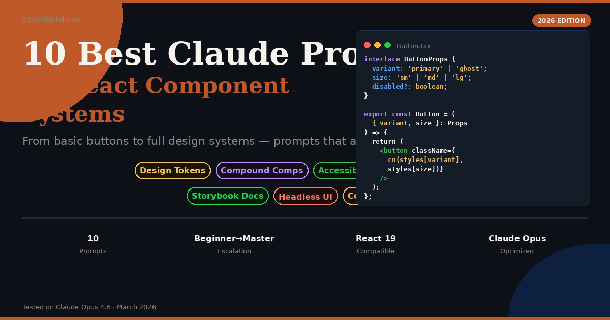
10 Best Claude Prompts for Building React Component Systems
components/ folder and a vague sense that you should
probably have a design system at some point. Three months later, you have 47 slightly different
button components across 12 files, zero documentation, and a growing dread every time a
designer says the word “consistency.” If that sounds familiar, these prompts are for you.
Building a proper React component system isn’t just about writing good components. It’s about building a structure — one where new developers can contribute without breaking things, where design decisions live in one place, and where every button in your app actually looks and behaves the same. That’s the whole job. It’s also, historically, the thing most teams keep meaning to do properly and never quite get around to.
Claude handles this problem unusually well, and the reason is specific: it can hold an entire component architecture in context and reason about it coherently. When you describe your design constraints, your existing stack, and your goals, Claude doesn’t just give you a component — it gives you a component that fits. That distinction matters more than it sounds like it should.
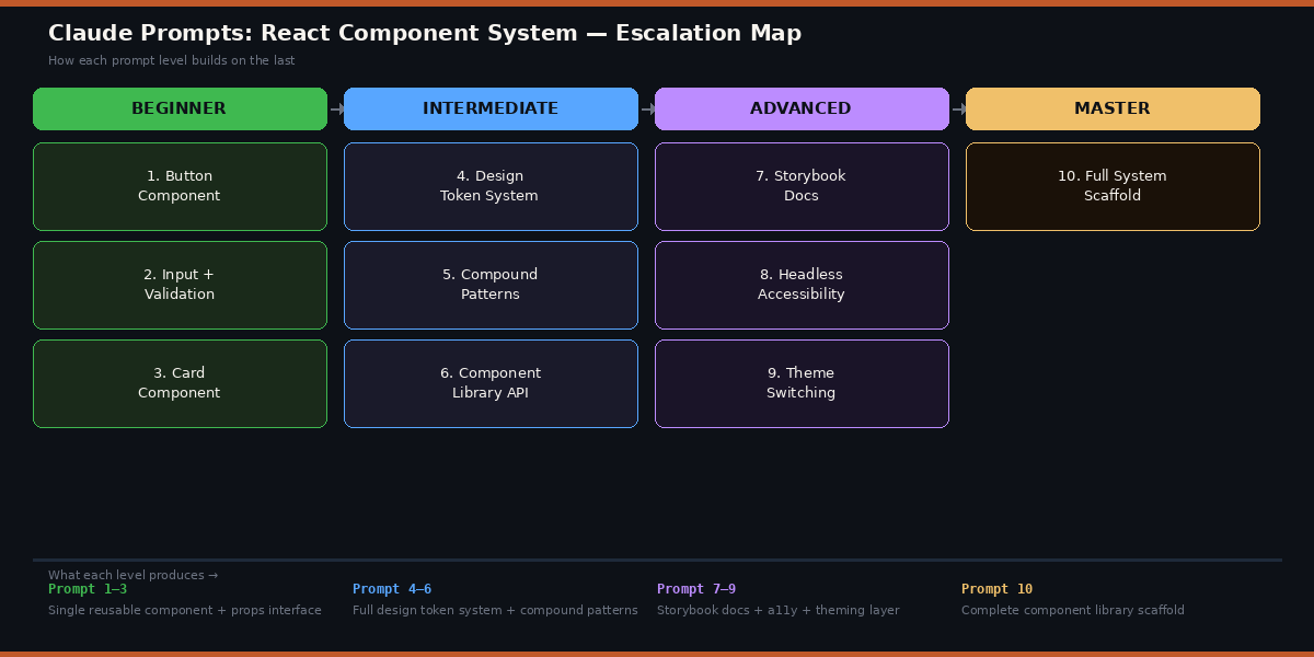
The ten prompts here escalate deliberately, from a clean reusable button (the thing everyone builds first) all the way to a full system scaffold complete with tokens, accessibility, theming, and documentation. Work through them in order and you’ll have a production-ready foundation by the end. Or pick the ones that match where you’re stuck right now — they all stand on their own.
Why Claude Handles React Component Systems Differently
The problem with most AI code generators and React is that they produce components in isolation. Ask for a modal and you get a modal. Ask for an input and you get an input. The modal and the input share no design decisions, follow no naming conventions, and definitely weren’t built with each other in mind. You end up with a patchwork rather than a system.
Claude’s long context window changes that dynamic. You can give it your entire design token file, your existing component API patterns, your TypeScript configuration, and your team’s coding conventions — all at once — and ask it to build something new that fits all of those constraints. It reads everything you give it and uses it. ChatGPT does this too, though Claude tends to hold larger context more reliably without losing details from the earlier parts of the document. GitHub Copilot is faster for autocomplete but isn’t designed for this kind of architectural reasoning.
The other thing Claude does well here is explain its design decisions. When it generates a compound component pattern, it tends to tell you why it structured things the way it did — which makes the output something you can learn from rather than just copy.
Claude’s strength isn’t just generating individual components — it’s generating components that fit a larger system. Feed it context and constraints, not just a bare request, and the output quality jumps significantly.
Before You Start: How to Get the Best Results
A few things will meaningfully improve your results before you type a single prompt. First, use Claude Opus 4.6 — the architectural prompts (especially 7–10) are complex enough that the difference between Opus and Sonnet is noticeable in output quality. For the beginner prompts, Sonnet is absolutely fine and considerably faster.
Second, paste your existing code. If you already have a tokens.ts file, a
component or two, or even just a colour palette in CSS variables, include it. The more Claude
knows about what you’ve already built, the better it can match your style. This is especially
true for the intermediate and advanced prompts.
Third, be specific about your stack. “React” is a starting point, not a specification. Claude will make better decisions when it knows: Are you using TypeScript? Tailwind, CSS Modules, or styled-components? React 18 or 19? Storybook? Vitest or Jest? The more you tell it, the less time you spend cleaning up incompatible output.
Start a Claude conversation with a short system context at the top: your tech stack, your naming conventions, and a few lines of your existing code. Pin that to the top of every new conversation about your component system. It saves you from repeating yourself and keeps outputs consistent across sessions.
The 10 Best Claude Prompts for Building React Component Systems
Prompt 1: The Foundation Button Component
Every component system starts with a button. Not because buttons are exciting, but because getting a button right — with all its variants, states, and accessibility requirements — is actually the clearest possible test of whether your component architecture is solid. A well-built button component tells you everything about how the rest of the system will work.
This prompt produces a complete, production-ready button with variants, sizes, loading state, icon support, and proper TypeScript types — all in one shot.
Build a reusable React Button component in TypeScript.

Requirements:
- Variants: [primary | secondary | ghost | danger]
- Sizes: [sm | md | lg]
- States: default, hover, focus, disabled, loading
- Props: leftIcon, rightIcon (accepts React nodes)
- Full ARIA attributes for accessibility
- Forwards ref using React.forwardRef
- Extends native HTML button attributes via ButtonHTMLAttributes

Stack: [TypeScript + CSS Modules / Tailwind / styled-components]

Output:
1. The Button.tsx component
2. A Button.types.ts file with all interfaces
3. Basic CSS/styles for each variant and size
4. A short usage example showing all variants

// Keep the API intuitive — a developer should be able to use this
// without reading any docs.
extends ButtonHTMLAttributes line is the key instruction. Without it, Claude
often produces components with incomplete prop types that don’t accept standard HTML button
attributes like onClick, type, or form. Spelling out
forwardRef also prevents Claude from skipping it — a common omission that causes
problems the moment you need to focus the button programmatically.
Prompt 2: Form Input with Validation States
The problem most people run into with input components is that they forget about all the states an input can be in. Default, focused, filled, error, success, disabled — each one needs its own visual treatment. This prompt builds the full picture from the start.
Create a TextInput component in React + TypeScript with full validation state support.

Requirements:
- Props: label, placeholder, helperText, errorMessage, successMessage
- States: default | focused | error | success | disabled
- Visual indicator for each state (border colour, icon, message text)
- Required field indicator (asterisk on label)
- Accessible: links label to input via htmlFor / id, announces errors with aria-describedby
- Forwards ref
- Compatible with React Hook Form (controller-friendly)

Include a working example with a simple email validation demo.

// The component should look polished out of the box but allow style overrides.
onChange, onBlur, and value
correctly — and it wires those up without you having to specify each one.
Prompt 3: Composable Card Component
Cards are deceptively tricky. They need to hold any kind of content — images, text, actions, metadata — without becoming a component with forty props. The right pattern is slots, not props. This prompt produces a card that composes naturally rather than one you have to configure.
Build a composable Card component system in React + TypeScript.

Use a slot-based composition pattern with sub-components:
- Card — the outer container (variants: default | elevated | outlined | flat)
- Card.Header — for title, subtitle, and optional avatar/icon
- Card.Body — for main content
- Card.Footer — for actions, typically buttons
- Card.Media — for images or video thumbnails (top, bottom, or full-bleed)

The Card should be:
- Clickable optionally (pass an onClick or href to make the whole card interactive)
- Responsive
- Accessible when clickable (keyboard navigable, proper role)

Show three real usage examples:
1. A blog post card (media + title + excerpt + read-more link)
2. A user profile card (avatar + name + bio + follow button)
3. A stat card (icon + number + label)

// Composition over configuration — the card itself should stay simple.
Prompt 4: Complete Design Token Architecture
Here is where it gets interesting. Without a token system, every component makes its own colour and spacing decisions. With one, you change a single value and the change propagates everywhere. This prompt creates the token layer your entire component system should be built on.
You are a senior design systems engineer. Create a complete design token system for a React component library.

Brand context:
- Primary colour: [#your-hex]
- Style: [modern/minimal | warm/editorial | bold/expressive]
- Target: [SaaS dashboard | e-commerce | portfolio | marketing site]

Generate the following token layers:

1. tokens/primitives.ts — raw values (all colours as a scale 50–950, spacing scale 0–96, font sizes, weights, line heights, border radii, shadows)

2. tokens/semantic.ts — semantic aliases that reference primitives:
   - color.background.primary, color.text.default, color.border.subtle, etc.
   - Both light and dark mode values

3. tokens/css-variables.ts — exports a function that generates CSS custom properties from semantic tokens, switchable by data-theme attribute

4. A brief TOKENS.md explaining the two-layer approach for new contributors

// Follow the W3C Design Tokens specification format where possible.
Prompt 5: Tabs Compound Component with Context
Compound components are the architecture pattern that separates junior component code from senior component code. Instead of passing everything as props to one big component, you compose the UI from pieces that share hidden state. Tabs are the canonical example — and they’re genuinely tricky to get right.
Build a Tabs compound component in React + TypeScript using the Context API.

Architecture:
- Tabs — root provider component (manages active tab state)
- Tabs.List — container for tab triggers
- Tabs.Tab — individual tab button (accepts value prop)
- Tabs.Panel — content panel linked to a tab by matching value

Requirements:
- Controlled (value + onValueChange) and uncontrolled (defaultValue) modes
- Full keyboard navigation: Arrow keys to move between tabs, Home/End for first/last
- ARIA: role="tablist", role="tab", role="tabpanel", aria-selected, aria-controls
- Animated panel transitions (CSS only, no dependencies)
- TypeScript: strong generic typing so value is inferred from the tabs you declare

Usage example showing both controlled and uncontrolled patterns.

// The developer using this should never need to wire up click handlers themselves.
Prompt 6: Consistent Component Library API
Most component libraries have a consistency problem. The Button takes variant,
the Badge takes type, and the Alert takes kind. They all mean the
same thing, but three different developers built them on three different days. This prompt
creates the conventions that prevent that problem before it starts.
I'm building a React component library. Create a consistent API specification and an index entry point.

Existing components: [paste your current component list and their props]

Task 1 — API Conventions Document:
Define standard prop names we'll use across ALL components:
- Visual variation: variant, size, shape, tone
- State: isDisabled, isLoading, isReadOnly, isRequired
- Layout: fullWidth, align, justify
- Callbacks: onChange, onFocus, onBlur, onPress (for mobile-friendly semantics)
Explain when to use each and show a brief example.

Task 2 — index.ts entry point:
Generate a barrel export file that:
- Exports all components and their TypeScript types
- Groups exports logically (Inputs, Layout, Feedback, Navigation, Overlay)
- Includes a version constant: export const VERSION = '1.0.0'
- Is tree-shakeable (named exports, no wildcard re-exports that bundle everything)

Task 3 — Migration note:
Identify any prop naming inconsistencies in my existing components and suggest fixes.

// Consistency > cleverness. Every prop name should be predictable.
Prompt 7: Storybook Documentation Generator
Nobody writes Storybook stories. They mean to, they know they should, and then they don’t. This prompt takes any component you’ve already built and produces complete, useful stories and MDX documentation in one pass — including the edge cases you’d forget to cover manually.
Generate complete Storybook 8 documentation for this React component:

[paste your component code here]

Output 1 — ComponentName.stories.tsx:
- Default export with proper Meta type using satisfies
- A "Default" story covering the happy path
- Individual stories for every variant and size combination
- An "AllVariants" story that renders all variants in a grid for visual testing
- Stories for edge cases: disabled state, loading state, very long text, empty/null props
- Use Storybook's play() function for interactive stories (click, type, keyboard nav)
- ArgTypes configured for all controllable props

Output 2 — ComponentName.mdx:
- Introduction explaining the component's purpose and when to use it
- "When to use / When not to use" guidance
- Props table generated from the TypeScript interface
- 3–4 code examples covering real-world use cases
- Accessibility notes and keyboard interaction table

// The stories should read like examples a developer would actually want to copy.
AllVariants story is the part most people skip — and it’s the
most valuable one for visual regression testing. Claude generates it automatically here
because it’s specified. The MDX “when not to use” section is equally underrated: it tells
developers which component to reach for when they’re about to misuse this one.
Prompt 8: Headless Accessible Combobox
Accessibility is the thing component systems get wrong the most. It’s not malicious — it’s just genuinely hard, and the ARIA spec for interactive widgets is long and unforgiving. A combobox (the searchable select) is the most complex accessible widget in most design systems, which makes it the best test of whether you’re doing accessibility seriously.
Build a fully accessible, headless Combobox component in React + TypeScript.

"Headless" means: zero default styles, only logic and accessibility. Consumers apply their own styles via className props or render props.

Accessibility requirements (WCAG 2.1 AA — APG Combobox pattern):
- role="combobox" on the input, role="listbox" on the dropdown
- aria-expanded, aria-haspopup, aria-autocomplete, aria-activedescendant
- aria-selected on each option, aria-disabled for disabled options
- Keyboard: Arrow Up/Down to navigate, Enter to select, Escape to close, Tab to leave
- Screen reader: announces "N options available" when list opens
- Focus stays on input throughout — never jumps to the list

API design:
- Controlled: value + onValueChange
- options: accepts { label: string; value: string; disabled?: boolean }[]
- filterFunction: optional custom filter (defaults to case-insensitive label match)
- renderOption: render prop for custom option markup
- emptyState: slot for "no results" content

Include a styled usage example using Tailwind to show it working visually.

// Test this with VoiceOver on macOS before shipping. This prompt is the first step.
Prompt 9: Multi-Theme System with CSS Variables
Dark mode is table stakes now. But a real theme system goes further — it supports multiple brand themes, respects OS preferences, persists the user’s choice, and applies without a flicker on load. This prompt wires all of that up using the token system from Prompt 4.
Build a complete theme switching system for a React + TypeScript app using CSS custom properties.

// Paste your tokens/semantic.ts from Prompt 4 here if available

Requirements:

1. ThemeProvider.tsx:
   - Wraps the app and injects CSS variables for the active theme onto :root
   - Props: defaultTheme, storageKey (for localStorage persistence)
   - Detects OS preference via prefers-color-scheme media query
   - Priority: user-saved choice > OS preference > defaultTheme
   - Exposes useTheme() hook: returns { theme, setTheme, themes }

2. useTheme.ts hook:
   - Reads and sets theme with localStorage persistence
   - Prevents flash of unstyled content (FOUC) using a blocking script technique

3. ThemeToggle.tsx:
   - Ready-to-use toggle component (Light / Dark / System options)
   - Accessible: uses a button group with aria-pressed states

4. Support for [2 or 3] total themes: [light | dark | high-contrast]

5. A short guide explaining how to add a new theme in 3 steps.

// No flicker. No flash. Test on a cold page load with localStorage cleared.
Prompt 10: The Complete Component System Scaffold
This is the one that pulls everything together. Think about what this actually requires: Claude needs to reason about file structure, token architecture, component API conventions, accessibility standards, documentation strategy, and testing approach — simultaneously, for a system it’s never seen before. Feed it your brand context and watch it generate a production-ready starting point that would normally take a week to set up manually.
You are a principal engineer at a design systems consultancy. Scaffold a complete, production-ready React component library from scratch.

Project context:
- Product: [brief description — e.g., "B2B SaaS analytics dashboard"]
- Brand: primary [#hex], style [modern/minimal | warm | bold]
- Stack: React 19, TypeScript 5.4, [Tailwind | CSS Modules], Storybook 8, Vitest
- Team: [N] developers, mixed experience levels
- Timeline goal: first components in production within [X weeks]

Deliver the following:

1. Folder structure — complete directory tree with a comment explaining each folder's purpose

2. Token system — primitives.ts, semantic.ts, and CSS variable generation (light + dark)

3. 5 foundation components — Button, TextInput, Card, Badge, Spinner
   Each with: TypeScript interfaces, logic, styles, and a 3-story Storybook file

4. Compound component — a fully accessible Modal (Modal, Modal.Trigger, Modal.Content, Modal.Header, Modal.Footer) with focus trapping and scroll lock

5. Theme system — ThemeProvider, useTheme hook, ThemeToggle (no FOUC)

6. Testing setup — Vitest + Testing Library config; one complete test file for Button covering: renders all variants, handles click, is keyboard accessible, shows loading state

7. CONTRIBUTING.md — component creation checklist, API conventions, PR requirements

8. package.json — with scripts for dev, build, test, storybook, and lint

// Build this like it needs to survive the next three years and four developers.
// Optimise for clarity and consistency over cleverness.
// Flag any decisions where there are significant tradeoffs.
Common Mistakes and How to Fix Them
Most people get decent results from Claude on the first few prompts and then hit a wall. The wall isn’t Claude’s fault — it’s a pattern of prompt mistakes that predictably degrade output quality. Here are the ones that show up most often.
Mistake 1: Not Giving Claude Your Existing Code
Asking Claude to build a component “that matches your existing style” without actually showing it your existing code produces components that match a generic style — not yours. Claude can’t guess your naming conventions, your import patterns, or your CSS approach. Paste everything relevant and the output will be genuinely compatible.
Mistake 2: Asking for Too Many Things at Once
“Build a complete authentication flow with login, register, password reset, email verification, and social OAuth” is one prompt that should be four separate conversations. Claude produces better output when the scope is focused. Use the master prompt (Prompt 10) for architecture, then separate prompts for implementation.
Mistake 3: Ignoring the TypeScript Types
If you only copy the JSX and ignore the TypeScript interfaces Claude generates, you’re throwing away the most valuable part of the output. The types are where component API design lives. Review them before you review the implementation.
Mistake 4: Accepting the First Version
Claude’s first output is a starting point, not a final answer. Follow up with: “This looks good, but the loading state prop doesn’t handle the case where the button has an icon. How would you modify it?” The iterative conversation is where the good stuff happens.
| MISTAKE | WRONG APPROACH | RIGHT APPROACH |
|---|---|---|
| Missing context | “Build me a button that matches my design system” | “Build me a button — here’s my existing tokens file and an example component: [paste]” |
| Vague stack | “Use React and whatever styling makes sense” | “React 19, TypeScript 5.4, Tailwind v4, CSS Modules for component-scoped styles” |
| No iteration | Copy the output and move on | Review, test, then ask: “Here’s a gap I noticed — how do we fix it?” |
| Skipping accessibility | “Add a modal component” | “Add a modal with focus trapping, aria-modal, and keyboard dismiss — ref the APG dialog pattern” |
| No type review | Copy JSX, skip the TypeScript interfaces | Review interfaces first — they define the public API. Fix issues there before touching implementation |
“The best Claude output I’ve ever gotten was in a conversation where I pasted three files of existing code and said: this is what we have. Now build the next thing that fits.” — Common pattern among experienced Claude users in the developer community
Where Claude Still Struggles with React Systems
None of this comes free. Claude is genuinely strong at architectural reasoning and component API design, but there are specific areas where the output needs more careful review before you ship it.
Complex state machines. If your component needs a formal state machine — a multi-step form, a drag-and-drop interface, or anything with complex transitions between states — Claude tends to produce imperative state logic that works but doesn’t scale well. The output is usually correct for the happy path and brittle for edge cases. You’ll want to review state management logic more carefully than component structure logic, and consider reaching for XState for anything truly complex.
Performance optimisation. Claude doesn’t proactively think about render
performance unless you ask. It won’t reach for useMemo, useCallback,
or memo without a reason, and when it does add them it sometimes does so
incorrectly — memoising things that don’t need it and missing things that do. If you’re
building performance-sensitive list components or data-heavy dashboards, explicitly ask it
to reason about renders.
Real-world edge cases in accessibility. Claude knows the ARIA spec and will implement it if you ask. What it can’t do is replicate the experience of actually testing with VoiceOver, NVDA, or JAWS on real content. The keyboard navigation and ARIA roles will be correct — but the experience for an actual screen reader user needs human testing. Treat Claude’s accessibility output as a very solid first implementation, not a certified accessible component.
What you’ve picked up from these prompts isn’t just a collection of component code — it’s a way of thinking about component systems that transfers. The pattern is always the same: give Claude your constraints, your existing work, and a precise specification of what you need. Get output that fits your system rather than a generic example. Iterate from there.
There’s a deeper principle at work here. Working with Claude on a codebase is most productive when you treat it as a very fast collaborator rather than a vending machine. It reasons about tradeoffs when you give it context about why you’re making a decision. It catches issues you’d miss when you ask it to review rather than just generate. The prompts above are structured to create that kind of conversation, not to shortcut it.
Component systems still require human judgment — especially around naming decisions, breaking changes, and the long-term maintenance burden of abstractions that seem clever today. Claude can produce a very good compound Tab component, but it can’t tell you whether your team is ready to maintain one. Those calls are still yours to make.
As Claude Opus continues to improve in 2026, expect architectural reasoning to get sharper and context handling to expand further. The prompts in this guide will remain effective, but the ceiling on what you can accomplish in a single conversation is rising. Teams that build a habit of working this way now will find themselves significantly ahead when that capability expands. Start with Prompt 1, ship something today, and add more of the system as your product needs it.
Try These Prompts Right Now
Open Claude Opus 4.6, paste Prompt 1 with your stack details, and you’ll have a production-ready Button component in under two minutes. The system builds from there.
")