The New Era of Image Generation: Consistent Characters and Text That Actually Renders
Two problems have frustrated AI image generators since the first public tools launched. The first: generate the same character twice and you get two different people. The second: ask a generator to put readable text in an image and you get decorative gibberish. Both problems have now been substantially addressed — and understanding how changes everything about how these tools fit into real creative and commercial work.
Picture a children’s book author who found the ideal AI-generated illustration style in late 2024. Warm, slightly textured, expressive characters with a particular palette. The style worked. The problem was the main character — a small girl named Mara — looked meaningfully different in every image. Different nose shape, different eye spacing, different hair texture. Not enough to break the style, but enough that any editor picking up the manuscript would immediately see the inconsistency. The book required 24 illustrations. Getting all 24 to show the same Mara, in a consistent enough way to publish, took more retouching time than writing the book.
That author’s workflow today looks nothing like it did eighteen months ago. The tools changed. Not incrementally — the core underlying capability shifted, and with it the practical viability of AI image generation for any work that requires a recognizable, repeatable character across multiple images.
The text rendering story is similar. Asking any major image generator in 2023 to produce an image with readable text — a product label, a poster headline, a book cover — was an exercise in optimism. The models returned images where text-shaped noise occupied the space where text should be. Stylistically plausible, semantically useless. In 2026, the situation has changed enough that entire product mockup and social media graphics workflows have been rebuilt around AI-generated text-in-image. This article covers what changed, which tools lead, where the limits still are, and 10 prompts designed to take full advantage of both breakthroughs.
Why These Two Problems Are Harder Than They Look
The problem most people run into when they first encounter character inconsistency is the assumption that it reflects a software limitation that someone just needs to fix. It does not. It reflects something fundamental about how diffusion models generate images — each generation is stateless. The model has no memory of the image it produced ten seconds ago. When you prompt “a young woman with red hair and green eyes in a park” twice, the model interprets each prompt as a fresh generation task. The statistical space of valid images matching that description contains thousands of meaningfully different women. Which one you get is partly determined by the random seed, partly by the specific wording, and partly by the model’s training distribution. Nothing in the standard generation loop connects one output to a previous one.
Character consistency, properly implemented, requires adding an external reference anchor that forces each new generation toward a specific visual target rather than anywhere within the valid prompt space. This can be a reference image, an embedding vector derived from a reference image, a LoRA trained on specific character images, or a seed value combined with precise prompt engineering. Each approach trades off flexibility against consistency — and different tools have taken meaningfully different approaches to where that trade-off lands.
The text rendering problem is different in mechanism but equally rooted in how the models are trained. Diffusion models learn image generation by absorbing statistical patterns from enormous datasets of images and their captions. Text in the training images existed in enormous variety — different fonts, sizes, angles, lighting conditions, partial occlusion, artistic stylization. The models learned to generate convincing-looking text-shaped patterns without developing any underlying representation of what letters actually are or how they combine into words. The result was text that looked superficially like the requested language but spelled nothing coherent — the “spaghetti text” that anyone who has prompted for text-heavy images in the past three years immediately recognizes.
Character inconsistency and broken text rendering are not the same type of problem. Consistency is fundamentally about memory and reference anchoring across stateless generations. Text rendering is about whether the model has any internal representation of language structure, not just visual patterns. The solutions are architecturally different — which is why different tools excel at one without necessarily excelling at both.
The 2026 Tool Landscape: Who Solved What
Here is where it gets interesting. No single tool in 2026 leads comprehensively on both consistency and text rendering. The landscape has diverged in ways that reward understanding which tool to reach for based on what a specific project requires.
Character Reference System
The --cref (character reference) and --sref (style reference) flags allow fine-grained control over how strongly a reference image influences the output. Character weight (--cw 0–100) controls how much the face/body transfers vs. just the style. Strong performer for visual character consistency.
Instruction-Following + Text
The instruction-following fidelity of GPT-4o’s image generation is the highest of any current tool — it will attempt exactly what you describe and correct mistakes in follow-up turns. Text rendering has improved dramatically with DALL-E 4: short strings (1–8 words) render legibly with high reliability.
Text-in-Image Leader
Ideogram was built with typographic accuracy as a first-class design goal. It uses a hybrid architecture that combines a diffusion backbone with a dedicated text layout system, meaning it understands letter forms rather than simulating them statistically. The current benchmark leader for any image where text legibility is the primary requirement.
Commercial-Safe + Brand Consistency
Firefly’s “Generative Match” feature allows consistent style and character application using reference images from a user’s own asset library. Particularly strong for brand consistency workflows because every output carries Content Credentials. Text rendering is competent for short strings, but Firefly’s real advantage is in commercial IP safety — all training data was licensed.
Photorealism & Detail
Flux 1.1 Pro (Black Forest Labs) delivers exceptional photorealistic detail and prompt adherence. Character consistency requires careful seed management and reference-image injection via compatible workflows (ComfyUI with IP-Adapter nodes). Text rendering has improved with recent fine-tunes but still requires careful prompt construction.
Maximum Control Ceiling
SD 3.5 with IP-Adapter and ControlNet gives the highest degree of character consistency achievable in open-weight models, including face-locked generation. The trade-off is workflow complexity: this is a ComfyUI/A1111 pipeline, not a web interface. The payoff for teams willing to build the workflow is production-grade character consistency.
The question is not which image generator is best. The question is which generator is best for this specific task in this specific workflow. A poster with a bold headline goes to Ideogram. A mascot character that needs to appear consistently across 40 marketing images goes to Midjourney with a character sheet. A product mockup with a safety label goes to DALL-E 4 with a multi-turn correction pass.
— aitrendblend.com Editorial Team, May 2026
How Character Consistency Actually Works in Practice
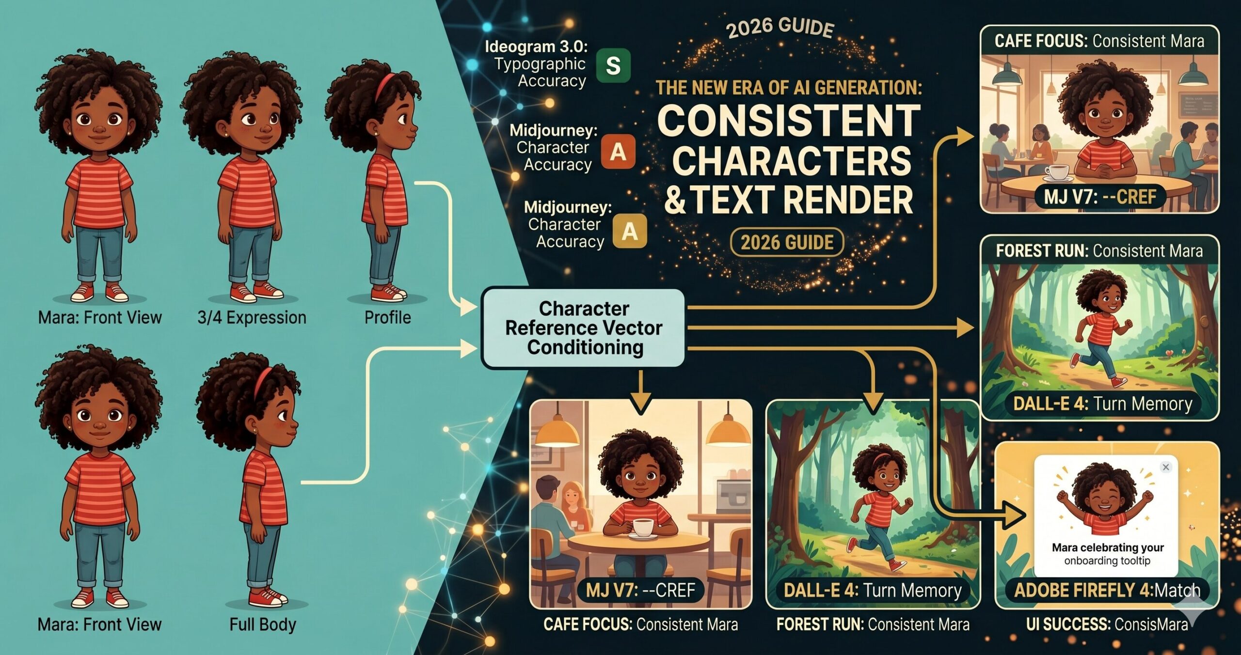
The character reference system in Midjourney V7 is worth understanding in concrete terms because it represents the approach most generative image platforms are converging toward. When you provide a character reference image via --cref [image URL], Midjourney encodes key visual attributes of the reference — facial structure, hair, skin tone, body proportions — into a conditioning vector that is applied to the generation process. The --cw parameter controls how strongly this vector influences the output. At --cw 100, the generated character closely resembles the reference face and body. At --cw 0, only the reference style carries over, not the specific character features.
The practical implication is that you need a canonical reference image before you can generate a consistent character at scale. This is the “character sheet” concept that professional illustrators and animation studios have always used — a single, definitive reference drawing showing the character from multiple angles with their key design elements labelled. The difference in AI workflows is that the character sheet is both your reference input and your quality anchor. Any generated image that drifts meaningfully from the sheet gets regenerated, not retouched.
View
View
View
Body
Sheet
--cref source for every subsequent scene. The sheet captures enough visual information that the model can interpolate the character correctly even in novel poses and environments not shown in the reference.DALL-E 4’s approach to character consistency is architecturally different. Rather than a reference image parameter, it relies on the multi-turn conversation memory built into the GPT-4o interface. If you generate a character in one turn and describe them explicitly — “remember this character: a tall woman in her 40s with silver-streaked black hair, warm brown skin, and angular wire-rimmed glasses” — subsequent generations in the same conversation will attempt to reproduce that description faithfully. The fidelity decreases the more turns pass between the initial description and the new generation, but for short sequences (3–5 images in one session), the consistency is workable. For longer projects, reference images can be injected directly into the conversation to re-anchor the model.
The timeline for how these capabilities arrived is worth knowing — because it explains why the workflows feel newer than they actually are.
Seed locking — the first workaround
Early consistency attempts relied on locking the random seed between generations. Reliable for identical compositions with minor variations; unreliable across different poses or scenes. The character drift problem remained essentially unsolved.
IP-Adapter and character reference parameters
IP-Adapter made face-consistent generation achievable in SD workflows. Midjourney V6 introduced --cref. The capability existed but required significant workflow knowledge to use reliably at production scale.
Ideogram 2.0 raises the text rendering bar
Ideogram’s hybrid architecture produced noticeably better typographic output than any competing tool. The industry acknowledged that text-in-image was a solvable problem rather than an inherent limitation of diffusion models.
Production-ready character and text pipelines
Midjourney V7’s refined character reference system, DALL-E 4’s text accuracy improvements, and Ideogram 3.0’s typographic precision brought both capabilities to a level where commercial production workflows are being built around them — not just individual image creation.
Before You Generate: Setting Up for Consistent Results
Think about what character consistency actually requires before you write a single prompt. You need a reference image of sufficient quality and neutrality — a character rendered clearly against a clean background, facing forward or in a 3/4 view, with no heavy shadows obscuring the features that need to carry across images. This sounds obvious, but the single most common reason character consistency fails is using a reference image that is too busy, too stylized, or too small for the model to extract reliable feature information from. A good character reference is almost boring to look at on its own — it is a specification document, not a finished illustration.
For text rendering, setup is about matching the right tool to the complexity of the text task. Here is the practical decision tree. Three words or fewer, any font style: DALL-E 4 or Ideogram both handle this reliably. A short headline (4–10 words) with basic styling: Ideogram 3.0 is the clear choice. Multi-line body text, complex layouts, or text integrated with detailed illustration: Ideogram with explicit typographic instructions is currently the only tool that approaches reliable results. Long-form text (paragraphs, bullet lists, extended copy): no current AI image generator handles this acceptably — hand off to a design tool after generating the visual layer.
One setup step that most tutorials skip entirely: before running a full character-consistency project, generate three test images from your character sheet at your target --cw value in different scene contexts and evaluate drift. Low drift means your reference image is strong enough to anchor the project. High drift means you need a better reference — more neutral lighting, cleaner background, or a higher-resolution source image. This 15-minute test saves hours of remediation downstream.
10 Prompts for Character Consistency and Text Rendering
Prompt 1: Character Sheet Generator
Every character consistency workflow starts here. Before you can use --cref or inject a reference image into any multi-turn conversation, you need a canonical reference image that is neutral enough to serve as an anchor. This prompt generates that reference — a clean multi-view character sheet in a style suitable for subsequent generation anchoring. Use it in Midjourney V7 or DALL-E 4 to establish your canonical character before generating any scene images.
Why It Works: The four-view layout captures enough facial and body information from multiple angles that any subsequent generation using this as a reference can interpolate the character correctly into novel poses. The flat, even lighting is deliberate — dramatic lighting in a reference image can cause the model to reproduce that lighting instead of applying the character features to the new scene’s lighting conditions. Clean background eliminates the risk of reference image backgrounds bleeding into scene generations.
How to Adapt It: For animated or cartoon characters, replace “editorial illustration style” with your target art style and add “character turnaround, model sheet style, used for animation production” to signal the functional purpose to the model and get cleaner, more professionally structured output.
Prompt 2: Simple Text Poster — Ideogram
The most common first use case for AI text rendering is a clean text-and-image poster — a product announcement, an event promotion, a social media graphic. Ideogram 3.0 handles this reliably when you follow the prompt pattern that its text layout engine responds to: explicit quotation marks around the exact text string, font family description, and clear spatial instructions for where the text sits relative to the image content.
Why It Works: Ideogram’s text layout system reads quoted strings as typographic targets rather than as visual descriptions. The explicit font weight, style, and position instructions feed Ideogram’s layout engine the parameters it needs to place text intentionally. Without position and contrast guidance, Ideogram may render readable text in a location that conflicts with the image content — technically successful text rendering, but visually poor composition.
How to Adapt It: For product label mockups, replace the poster framing with “wrapped around a cylindrical bottle / box surface” and describe the label area as a distinct panel. Ideogram handles product label text reliably when the label boundary is explicitly described as a separate geometric surface within the image.
Prompt 3: Consistent Character in a Scene (First Use)
Once you have a character sheet from Prompt 1, this is the first real test: place that character into a specific scene using Midjourney’s --cref parameter. The key principle is that the scene prompt should describe everything except the character’s face and body — assume the reference image will carry those details, and focus your prompt on environment, lighting, action, and mood.
Why It Works: Separating the scene description from the character description is the core technique. The --cref parameter handles “who is in this image.” The prompt text handles “what are they doing and where.” Trying to describe both the character AND the scene in text typically results in the model prioritising one over the other, or blending them inconsistently. The --cw 80 to --cw 100 range is appropriate for any scene where the character’s face is prominently visible — drop it to --cw 50 to --cw 60 for wide shots where precise facial features matter less than overall body shape and style.
How to Adapt It: For children’s book illustrations where the character appears in emotionally expressive situations, set --cw to 70 and add explicit emotion direction to the prompt — “her expression showing delighted surprise, eyebrows raised, mouth slightly open.” The lower character weight gives the model more room to generate natural expressions while still maintaining core character identity.
Prompt 4: Brand Mascot — Multi-Scene Package
A recurring business need that character consistency now makes tractable: a branded mascot or spokesperson character used across multiple marketing touchpoints. This prompt generates a complete multi-scene brief for a mascot character, designed to be run as a batch once you have established the canonical reference. Role assignment here matters — telling the model it is operating as a commercial illustrator producing a cohesive asset package improves the consistency of style decisions across all generated scenes.
Why It Works: Running a planning prompt in ChatGPT before executing in Midjourney means you get six consistent, well-structured scene prompts that have been reasoned through rather than written ad hoc. The six scenes correspond to the actual UI touchpoints where a brand mascot appears — which means the output is immediately usable in a product design handoff, not just a collection of character illustrations. The instruction to describe only scene and action — not the character’s appearance — ensures all six prompts will use the character reference correctly.
How to Adapt It: For a children’s book character rather than a brand mascot, replace the six UI applications with six narrative scene types: introduction, challenge, problem-solving moment, emotional low point, resolution, and celebration. The same prompt structure works equally well for sequential storytelling.
Prompt 5: Social Media Graphic with Integrated Text
Social media graphics that combine compelling imagery with on-brand text are one of the highest-volume use cases in marketing teams. This intermediate prompt uses Ideogram’s layout capabilities for a social post format that requires both image quality and text accuracy. The key here is specifying the text hierarchy — primary copy, secondary copy, and any brand element — as explicitly structured within the image space, not as a general stylistic direction.
Why It Works: Ideogram’s layout engine treats the text hierarchy you describe as a structured layout specification, not just a visual description. Specifying position (top area, centre, bottom right), size relationship (large, small, 70% opacity), and font family gives the layout engine enough parameters to produce a predictable, professionally structured composition. Without the hierarchy, Ideogram may render all text at a similar weight and fail to establish visual priority.
How to Adapt It: For event promotion graphics, add a date and location string to the hierarchy — Ideogram handles dates and short addresses reliably when they are presented as distinct text elements with explicit positioning. Keep each text element under 15 characters for maximum accuracy on the first generation pass.
Prompt 6: AI Avatar Voice-Matched Character
A workflow that connects AI image generation with AI video production: designing a character in an image tool that is then used as the basis for an AI avatar in HeyGen or Synthesia. This requires not just character consistency across images but a specific type of reference image that AI avatar tools can use as a source — frontal face, neutral expression, clean background, professional lighting. The prompt is both an image generation brief and a specification for downstream use.
Why It Works: DALL-E 4’s instruction-following fidelity is high enough that it reliably reproduces the specific technical requirements that AI avatar platforms need from a source image: forward-facing gaze, neutral expression baseline, clean background, no occlusion of facial landmarks. Midjourney produces more stylistically interesting portraits but is harder to constrain to the exact technical specifications that avatar software requires. For this particular use case, DALL-E 4’s literalism is the feature, not a limitation.
How to Adapt It: Once the avatar is created in HeyGen or Synthesia, save the original DALL-E 4 generation and its seed parameters as the canonical character reference. Any additional still images of this character — for website, social media, marketing materials — should use this source image as the reference, creating visual continuity between the video avatar and all print/digital representations.
Prompt 7: Sequential Story Panel — Consistent Character Across Scenes
This advanced prompt generates a set of connected narrative images — a comic panel sequence, a storyboard, a children’s book spread — where character consistency is maintained across scenes with different environments, lighting conditions, and character actions. The approach uses a system-level prompt to establish the rules of the generation session before individual scene prompts are executed. Run the system prompt in ChatGPT first to get optimised individual panel prompts, then execute each in Midjourney with the character reference.
Why It Works: The separation of concerns here is critical: ChatGPT reasons about narrative structure, scene composition, and visual continuity, then writes Midjourney prompts that are technically correct. Midjourney executes those prompts with the character reference applied. Attempting to write six consistent scene prompts manually typically results in inconsistent prompt structures — some scenes are described in detail, others vaguely, and the resulting images have varying levels of detail and compositional quality. The planning step normalises this before a single image is generated.
How to Adapt It: For marketing storyboards rather than narrative sequences, replace the story beats with touchpoint stages: awareness (character has a problem), consideration (character discovers your product), decision (character using the product), and advocacy (character recommending it). The same sequential consistency workflow applies to commercial storytelling as to fiction.
Prompt 8: Book Cover with Title and Author Text
Book cover design is the most demanding commercially relevant text-in-image task: the title must be large and legible, the author name must be rendered correctly, the imagery must integrate with the text rather than compete with it, and the whole thing must read at thumbnail scale. Ideogram 3.0 is currently the only AI image generator where this is reliably achievable without post-production text overlays. This prompt includes the structural specifications that Ideogram’s layout engine needs to produce professional-grade results.
Why It Works: The layout specification language — “upper third,” “positioned at bottom,” “clear spacing from edge” — maps directly to Ideogram’s text placement system. Telling the image concept to “leave clear space for text placement” is not cosmetic instruction — it signals to Ideogram’s layout engine that the text areas are intentional design zones that should not be filled with visual content. Without this, Ideogram may generate visually busy regions where text needs to sit, resulting in a cover that works as an image but not as a functional design. The verification note at the end is a genuine recommendation: always check Ideogram’s text output character by character before committing to a design.
How to Adapt It: For self-publishing workflows where the author wants to vary the cover across multiple editions or territories, run this prompt once to establish the typography and layout style, then use the first result’s style seed (--sref equivalent in Ideogram’s reference system) to generate variations with different image concepts while keeping the text treatment consistent.
Prompt 9: Character + Text Unified — Product Advertisement
This advanced prompt combines both the character consistency challenge and the text rendering challenge in a single image: a product advertisement where a recurring brand spokesperson character appears alongside a readable advertising headline. This is the most technically demanding combination because the model must simultaneously respect a character reference, render legible text, and compose both into a balanced advertisement layout.
Why It Works: Attempting to generate character and complex text simultaneously in a single Midjourney prompt is currently unreliable — the model’s priority is image quality and character consistency, and text accuracy is a secondary concern. The two-step workflow routes each challenge to the tool that handles it best. Midjourney generates the character placement with the correct spatial composition; Ideogram (or a design tool) handles the typographic layer. The instruction to leave 40% clear space in the Midjourney generation is what makes the composition work — it is not decorative instruction, it is a structural constraint that creates the text zone.
How to Adapt It: For animated social ads, the Step 1 Midjourney output becomes the first frame of a Runway Gen-3 video animation, with text added as a motion graphic overlay in Descript or CapCut. The character consistency carries through from still to motion because the character reference used for the still image is what appears in the animated version.
Prompt 10: Full Brand Visual System — Character, Typography, and Style Consistency
The master prompt in this collection does not generate a single image — it generates the specification document that governs all subsequent image generation in a brand visual system. This is the prompt engineering equivalent of a brand style guide: it establishes the canonical character reference, the typographic system, the colour rules, the style seeds, and the prompt patterns that all future brand image generation will follow. Run it once at the start of a brand visual project and use the output to brief any designer, illustrator, or AI workflow that touches the brand’s imagery.
Why It Works: The master prompt produces a specification that outlasts any individual image generation session. The six sections map directly to the six failure modes that cause brand image systems to degrade: character drift over time, style inconsistency, poor text treatment, wrong tool selection, unclear quality standards, and no structured onboarding for new team members. Section 5 — brand deviation rules — is the section most teams skip and the one that matters most over time. Vague quality standards result in subjective arguments about whether a generated image is good enough; specific, measurable deviation criteria make quality a process rather than a judgment call.
How to Adapt It: For solo creators rather than teams, compress Sections 4 and 6 and expand Section 1 and 2. The character sheet and style seed are the most critical assets for a solo creator who is their own quality control — the tool routing matrix matters less when one person is making all the generation decisions.
Six Mistakes That Undermine Character and Text Results
The failure modes of character consistency and text rendering are predictable enough that knowing them in advance is more valuable than learning them from published work that misses the mark.
| Mistake | Wrong Approach | Right Approach |
|---|---|---|
| Using a low-quality character reference |
WRONG Using a character reference image that has dramatic lighting, a complex background, heavy stylization, or a small face relative to the frame. The model extracts feature information from the reference — if that information is ambiguous or partially obscured, the extracted features will be inconsistent across generations. |
RIGHT The canonical reference image is specifically generated for use as a reference — neutral lighting, clean background, face filling at least 40% of the frame height, clear view of the key identifying features. It is a specification, not a final illustration. |
| Describing the character in the scene prompt |
WRONG “A tall woman with auburn hair and freckles, wearing a blue jacket, standing in a forest clearing looking thoughtful, –cref [URL] –cw 80.” Describing the character in text alongside the character reference confuses the model — it receives competing instructions about what the character looks like, and the blend is typically worse than either source alone. |
RIGHT The scene prompt describes the scene, environment, action, mood, and lighting. Nothing about the character’s face or body. “A figure standing in a sun-dappled forest clearing, looking thoughtful, late afternoon light filtering through the canopy.” The character reference handles appearance; the text handles context. |
| Asking for too much text in one generation |
WRONG Prompting for a poster with a headline, subheadline, three bullet points, a CTA, a URL, and a legal disclaimer — even in Ideogram. Text rendering accuracy degrades with each additional text element. Attempting to render a complex text layout in a single generation pass produces a result where some elements are accurate and others are garbled. |
RIGHT Generate the image and primary text element first. Evaluate text accuracy before adding secondary elements. For complex layouts, generate the visual layer and headline in Ideogram, then add supporting copy and supplementary text in Canva, Figma, or Adobe Express. AI handles the hard creative work; the design tool handles the precise typographic work. |
| Not verifying text before publishing |
WRONG Publishing an AI-generated image with text after a quick visual check. At a glance, the text looks correct — but letter-by-letter inspection reveals a substitution: “LAUNCH” has become “LAUCH” or a closing quotation mark is replaced with a comma. These errors are invisible until a viewer notices them, at which point the image is already in circulation. |
RIGHT Every AI-generated image with text gets a character-by-character verification before use. Build this into the QA step: the person approving the image reads each word aloud and confirms each letter matches the intended string. This takes 30 seconds and prevents the kind of error that ends up screenshotted and shared as an AI failure example. |
| No style reference alongside the character reference |
WRONG Using only –cref with no –sref or style-anchoring text in Midjourney. The character reference controls what the character looks like; it does not control the visual style of the scene. Images from the same character reference can end up with different colour palettes, lighting moods, and texture treatments because style was not anchored. |
RIGHT Every production prompt uses –cref for character AND includes either a –sref (style reference URL from a locked reference image) or a consistent style description appended to every prompt. The style seed is as important as the character seed for visual consistency at scale. |
| Wrong tool for the text complexity |
WRONG Using Midjourney for a headline-heavy social graphic because you prefer its visual output quality. Midjourney’s text rendering has improved in V7 but remains unreliable for anything beyond one or two very short words. Repeatedly regenerating a Midjourney image hoping for better text output is wasted time. |
RIGHT The tool routing decision is made at the task level, not the preference level. Text-heavy graphics go to Ideogram regardless of whether you prefer Midjourney’s art style. Text-free character imagery goes to Midjourney for the best character reference results. Hybrid images use the two-step workflow. |
The six mistakes above share a pattern: they all involve using a single tool as if it were a generalist solution and being surprised when the specialist use case fails. Character consistency and text rendering are not features of a single tool — they are capabilities distributed across a toolset. Building good workflows means knowing which tool to route each task to, and accepting that no single tool wins on every dimension.
Where These Tools Still Fall Short in 2026
The progress on character consistency and text rendering is real and the gap with where these tools were eighteen months ago is genuinely large. But honesty about the remaining limits is more useful than a triumphalist account, because the limits are exactly where production decisions need to be made carefully.
Character consistency across extreme pose or age variations remains unreliable. A character reference image showing a character in a neutral standing pose will maintain consistent facial features across most scene variations — sitting, walking, looking in different directions. It will not reliably maintain consistency when the scene requires the character at a dramatically different age, a view from far above, an extreme close-up showing only the eyes, or a highly distorted artistic style that abstracts the face. The model’s feature extraction works within a range; generate outside that range and the consistency degrades noticeably. The practical response is not to avoid these shots but to budget extra generations and manual selection time when they are required.
Text rendering beyond a single language is inconsistent even in Ideogram. English headline text is rendered at high accuracy. French, Spanish, and German work well. Arabic, Hebrew (right-to-left scripts), Chinese, Japanese, and Korean are significantly more variable — Ideogram handles them better than any competing tool, but “better than the alternative” is not the same as “reliable enough for publication without verification.” For multilingual campaigns, the verification step is not optional and the acceptance rate on first generation is lower. Factor this into production timelines.
Neither character consistency nor text rendering currently works reliably in animated or video generation. The character consistency techniques that work in Midjourney — reference image injection, character weight parameters — do not transfer cleanly to Runway Gen-3 or Sora. Video generation tools are at roughly the same point that image generation tools were in 2024 on consistency: the capability exists in limited forms, it works well for short sequences and simple scene types, and it degrades with complexity. Consistent character across a two-minute video with varied environments and complex action is not yet achievable through prompt-based video generation alone. It requires stitched sequences, reference frame techniques, and significant human selection and editing. Teams building video workflows should treat character consistency in video as an emerging capability worth watching, not a current production-ready feature.
The children’s book author whose workflow opened this article published her book. Twenty-four illustrations of Mara, consistent enough that an editor reading the manuscript saw the same girl on every page. The retouching time dropped from hours per illustration to minutes. The creative time — deciding what each scene should contain, what Mara’s expression should be, what the background said about the story’s emotional register — stayed exactly where it should be: with a human who understood the story.
That is the shift that matters. Not that AI can now generate more images faster, but that the constraints that previously forced creative compromises — change the character slightly so this image works, skip the text element because you cannot generate it reliably — are no longer forcing those compromises. The tools have moved closer to a state where the creative decision is what the image should say, not what the current toolset can technically produce.
Human judgment has not been removed from this workflow. It has been concentrated in the decisions that were always the important ones: does this character feel true to the story? Does this headline communicate what we need it to communicate? Does this image, at thumbnail scale, on a phone screen, do the work it is supposed to do? Generating the image has become faster and more controllable. Deciding whether the image is right still requires a person.
The next 12 to 18 months will push character consistency into video workflows with increasing reliability, and text rendering will likely extend to reliable multi-line layouts in the leading tools. The gap between what AI generates and what a skilled illustrator or designer produces will narrow further — not to zero, but to a range where the choice between AI generation and human creation becomes genuinely context-dependent rather than quality-determined. The workflows that take full advantage of what these tools do well — consistent, on-brief, fast visual production — are the ones worth building now, while the toolset is still distinctive enough that the advantage is real.
Put These Prompts to Work
Start with Prompt 1 — your character sheet. Every other prompt in this collection builds on the canonical reference it creates. Open your preferred tool and generate your first consistent character today.