10 Best ChatGPT Prompts for Data Analysis (2026 Guide) | AITrendBlend
ChatGPT Data Analysis Python SQL 2026 Guide

10 Best ChatGPT Prompts for Data Analysis

10 Best ChatGPT Prompts for Data Analysis 2026 — dark banner with Python code, charts, and data science visuals

You have a spreadsheet with 50,000 rows, a deadline in three hours, and absolutely no idea where the anomaly in column G is coming from. Or maybe you have clean data but no clue how to turn it into a story your stakeholders will actually read. This is where ChatGPT stops being a chatbot and starts being the data partner you always wished you had — one that writes Python, explains statistics without the condescension, and can generate a full business insights report from your pasted numbers in minutes.

Data analysis used to require three different skill sets: coding (Python or R), statistical knowledge, and the ability to communicate findings clearly in plain English. Most analysts are strong in one or two of those areas and quietly struggle with the third. ChatGPT does not replace any of those skills — but it dramatically lowers the cost of the weak spots. A marketing analyst who has never touched pandas can now clean a dataset. A data scientist who hates writing reports can now generate one. A business student running their first regression analysis can now understand what their p-value actually means.

The prompts in this guide are built around how ChatGPT’s Advanced Data Analysis feature (the Python code execution sandbox) actually behaves — not how a generic AI writing tool behaves. They account for the model’s tendency to default to overly commented code, the way it handles ambiguous column names, and the specific instructions that produce analysis reports your colleagues will want to read rather than politely ignore. Whether you work in Excel, pandas, SQL, or plain spoken English, there is a prompt here that will change how fast you move through data.

Why ChatGPT Handles Data Analysis Differently

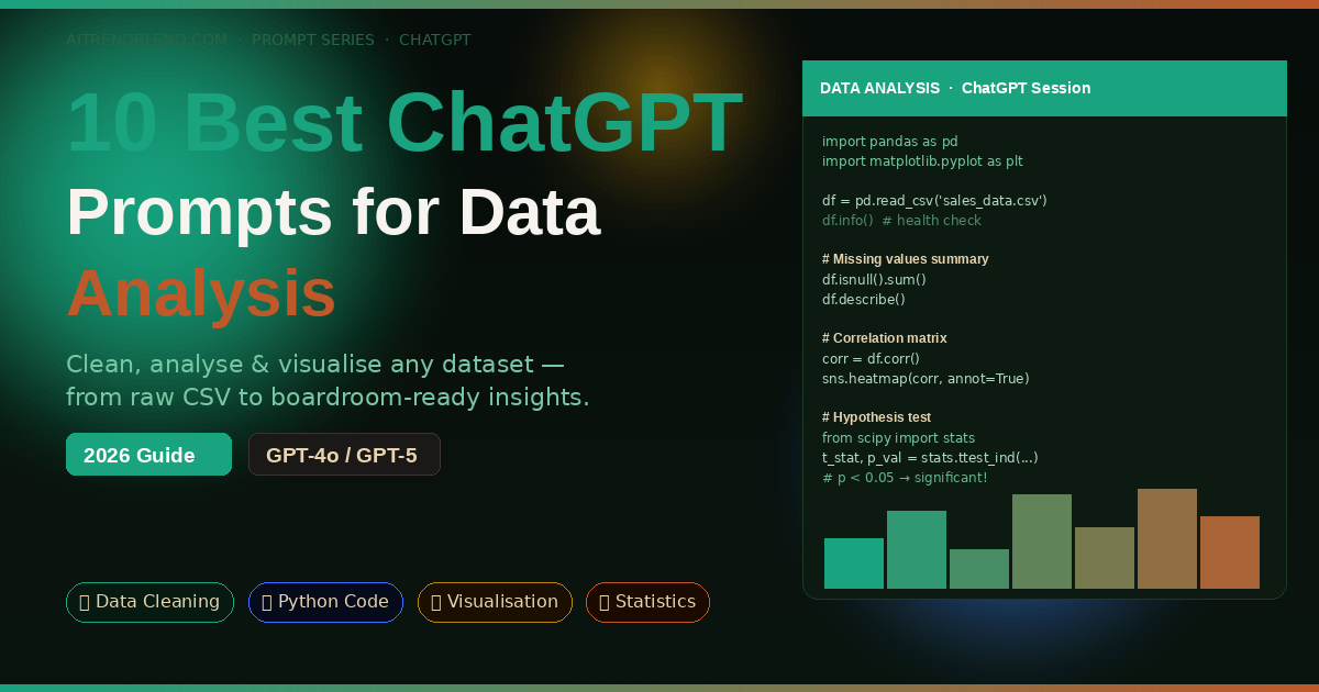
The feature that makes ChatGPT genuinely useful for data analysis — rather than just interesting — is the Advanced Data Analysis tool (formerly called Code Interpreter). When you upload a CSV, Excel file, or paste data directly into the chat, ChatGPT does not just describe what it thinks the data contains. It actually executes Python code in a sandboxed environment, reads the file, runs real computations, and shows you the output. That distinction matters enormously. Most AI tools hallucinate statistical results when given data. ChatGPT with Advanced Data Analysis computes them.

Compared to Gemini or Claude in this specific use case, ChatGPT has a meaningful edge in the size and maturity of its code execution environment. The sandbox supports pandas, numpy, matplotlib, seaborn, scipy, scikit-learn, and most of the standard data science stack. You can upload a dataset, ask for a regression analysis, and get working Python code alongside the actual output — charts, tables, and coefficient values — all in the same response. Claude is a strong writer for explaining analysis, but its code execution environment is newer. Gemini’s data handling is improving but still less reliable for multi-step analytical workflows.

The other edge is GPT-5’s improved reasoning about statistical validity. Ask it whether your sample size supports a particular test, and it will give you a thoughtful answer that references the assumptions behind the test — not just a yes or no. That kind of methodological awareness is what separates a useful data analysis partner from an expensive autocomplete tool.

⚡ Key Takeaway

ChatGPT’s Advanced Data Analysis (Python sandbox) actually runs your code and computes real results — it does not hallucinate statistics. Upload your data file and use the prompts below for genuine, reproducible analysis rather than AI-generated guesswork.

Before You Start: How to Get the Best Results

Three setup choices determine whether your data analysis session is fast and accurate or frustrating and circular. Get these right before you paste a single prompt.

Enable Advanced Data Analysis. In ChatGPT, make sure you are using GPT-4o or GPT-5, and that the Advanced Data Analysis tool is active (it shows a chart icon in the input bar). Without it, ChatGPT cannot actually run code or read your uploaded files. It will write code that looks plausible but is not verified against your actual data — a different and less useful experience.

Upload your data first, then prompt. Attach your CSV, Excel, or JSON file before sending your analysis request. When you lead with the file, ChatGPT automatically infers column names, data types, and likely analytical directions. Prompting without the file forces it to write generic template code that you then have to adapt manually — slower and more error-prone.

Describe your goal in business terms, not technical terms. “Find which sales regions underperformed in Q4” produces better analysis than “run a descriptive statistics summary.” The business framing gives ChatGPT the context to decide which statistics matter and which visualisations are worth generating. Technical jargon in the prompt often produces technically correct but analytically useless output.

ChatGPT Advanced Data Analysis setup workflow — file upload, model selection GPT-4o, and prompt strategy for accurate data results
Fig 1. Three-step setup for best ChatGPT data analysis results: Advanced Data Analysis mode, file upload before prompting, and business-goal framing rather than technical jargon.

The 10 Best ChatGPT Prompts for Data Analysis

Prompt 1: The Instant Dataset Health Check

Beginner Python

Before you analyse anything, you need to know what you are dealing with. Missing values, duplicated rows, wrong data types, outliers that will skew every calculation downstream — these are the invisible landmines in every real-world dataset. This prompt runs a complete health check in one shot and gives you a plain-English summary alongside the technical output. It is the first thing I run on any unfamiliar dataset.

Prompt 1 — Dataset Health CheckI have uploaded a dataset. Please run a complete data health check and give me: # 1. Basic overview – Number of rows and columns – Column names and their data types – First 5 rows as a preview # 2. Data quality issues – Missing values: count and percentage per column – Duplicate rows – Columns with only one unique value (useless features) – Numeric columns with obvious outliers (use IQR method) # 3. Plain-English summary Write a 3-sentence summary of what is in this dataset and flag the top 2–3 data quality issues I should fix before analysis. # Show the Python code you used, then show the output.
Why It Works

Asking for both code and output keeps the session transparent — you can see exactly what was run and reproduce it locally. The plain-English summary forces ChatGPT to translate technical findings into something you can act on immediately, not just a wall of numbers.

How to Adapt It

Add “Focus especially on the column named [COLUMN NAME] — I suspect there are encoding issues” to direct attention to a specific problem column. ChatGPT will zoom in on it without losing the overall health check.

Prompt 2: The Data Cleaning Autopilot

Beginner Python

Data cleaning is the part of the job everyone knows is necessary and nobody enjoys. It typically eats 60–80% of an analyst’s time on any new project. This prompt does not just flag problems — it fixes them and shows you the before/after comparison so you can verify the changes were sensible. The key is asking for a cleaning report alongside the code, so you stay in control of every decision rather than having a black-box transformation happen invisibly.

Prompt 2 — Data Cleaning AutopilotPlease clean this dataset and produce a cleaned version. Apply the following fixes: # Handling missing values – For numeric columns: fill missing values with the column median – For text/categorical columns: fill with the string “Unknown” – If any column has more than 40% missing values, drop it entirely # Fixing data types – Convert any date columns to datetime format – Strip leading/trailing whitespace from all text columns – Convert columns that look like numbers but are stored as strings # Removing noise – Remove exact duplicate rows – Remove rows where [KEY COLUMN, e.g. customer_id] is null # Output After cleaning, show: 1. A cleaning report: what was changed and why 2. Shape before vs after (rows × columns) 3. The first 5 rows of the cleaned dataset 4. Save the cleaned data as a downloadable CSV called cleaned_data.csv
Why It Works

The 40% threshold for dropping columns prevents ChatGPT from filling in essentially fabricated data for columns with too many gaps. The cleaning report makes every decision auditable — if a stakeholder asks why a row was removed, you have a documented answer.

How to Adapt It

For sales or financial data, replace the median fill with “fill with 0 for numeric columns representing counts or amounts” — median is appropriate for continuous measurements but wrong for transaction volumes where zero is the correct missing value.

Prompt 3: The Plain-English Statistics Explainer

Beginner

Statistics outputs are full of numbers that most people cannot interpret on the fly — correlation coefficients, standard deviations, p-values, confidence intervals. This prompt runs descriptive statistics on your dataset and then does something most analysts forget to do: it explains what the numbers actually mean for your specific data, in sentences a non-statistician can act on. Paste this prompt to any stakeholder who asks “what does the data say?” and you will have a usable answer in under a minute.

Prompt 3 — Plain-English Statistics ExplainerRun descriptive statistics on this dataset and explain the results in plain English. # Technical output needed: – Mean, median, standard deviation, min, max for all numeric columns – Value counts for all categorical columns (top 10 values each) – Correlation matrix for numeric columns # Plain-English interpretation: For each numeric column, write one sentence explaining what the spread of the data means in practical terms. For example: “The average [COLUMN] is [X], with most values falling between [LOWER] and [UPPER], suggesting [PRACTICAL IMPLICATION].” Then write a 4-sentence overall data story: what does this dataset tell us at a high level? Context about this data: [DESCRIBE WHAT THE DATA REPRESENTS, e.g. “monthly sales records for a UK e-commerce business, 2023–2025”]
Why It Works

The context field at the bottom is what separates generic statistics from useful statistics. Without it, ChatGPT writes interpretation sentences that could apply to any dataset. With it, the practical implications reference your actual business or research domain.

How to Adapt It

Append “Highlight the top 3 most interesting or surprising findings” after the 4-sentence data story. This forces the model to prioritise rather than list everything equally, giving you the analytical hook your presentation or report needs.

Prompt 4: The Python Analysis Code Generator

Intermediate Python

Here is where many analysts get stuck: they know what analysis they need but not exactly how to write the pandas code to run it. Googling pandas syntax sends you down a Stack Overflow rabbit hole for twenty minutes. This prompt generates complete, runnable analysis code for any specific analytical question — including the parts most tutorials skip, like handling edge cases where groups have fewer than the minimum sample size, or dealing with NaN values mid-calculation.

Prompt 4 — Python Analysis Code GeneratorAct as a senior data scientist. Write complete, production-quality Python code using pandas to answer this specific analytical question about my dataset: [YOUR ANALYTICAL QUESTION, e.g. “Which product categories had the highest month-over-month revenue growth in 2024?”] Dataset details: – Key columns: [LIST RELEVANT COLUMNS AND THEIR TYPES] – Date column format: [e.g. YYYY-MM-DD] – Dataset size: approximately [N ROWS] rows # Code requirements: – Use pandas and numpy only (no external libraries unless essential) – Handle NaN values explicitly — do not silently drop rows without logging them – Add a brief comment on each major step (not every line) – Include a final print statement that summarises the answer in one sentence – If the question requires grouping, ensure groups with fewer than [MIN_N, e.g. 30] samples are flagged, not silently included Run the code on my uploaded file and show me both the code and the output.
Why It Works

The minimum sample size flag is the instruction most generated code leaves out — and its absence causes silent statistical problems. Requiring a print summary rather than just a table forces the code to translate its own output into a human-readable answer.

How to Adapt It

For time-series analysis, append “Use a rolling 7-day window for smoothing before computing the trend.” For geographic data, add “Group by the region column and show results ranked highest to lowest.” Each addition steers the output toward a specific sub-type of analysis without rewriting the whole prompt.

Prompt 5: The Data Visualisation Strategist

Intermediate Visualisation Python

Most people default to bar charts for everything. That is not always wrong, but it is often not the clearest way to show what your data actually says. This prompt first recommends the right chart types for your specific analysis goals — explaining why — and then generates publication-quality Python code to produce them. The recommendation step is the part that saves you time: stopping you from building a pie chart that obscures the trend a line chart would have shown immediately.

Prompt 5 — Data Visualisation StrategistI want to create visualisations from this dataset. First, recommend the best chart types for each of my goals, then generate the Python code to produce them. My visualisation goals: 1. [GOAL 1, e.g. “Show the distribution of customer ages”] 2. [GOAL 2, e.g. “Compare revenue across product categories over time”] 3. [GOAL 3, e.g. “Show the relationship between ad spend and sales”] # For each goal, provide: (a) Recommended chart type and why it is the best choice for this data (b) One alternative chart type and when it would be better instead (c) Python code using matplotlib or seaborn to produce the chart # Chart quality requirements: – Figure size: 10×6 inches – Use a clean, presentation-ready style (seaborn “whitegrid” preferred) – All axes must have clear labels and units – Title must state the insight, not just describe the data (e.g. “Revenue Growth Accelerates in Q3” not “Revenue by Quarter”) – Use the colour palette: [e.g. “blues for positive values, reds for negative”]
Why It Works

The insight-driven title requirement is a small instruction with a large impact on presentation quality. “Revenue by Quarter” describes a chart. “Revenue Growth Accelerates in Q3” tells a story. That difference is what makes data visualisations persuasive rather than merely informative.

How to Adapt It

If your output is going into a slide deck or report with a specific colour scheme, replace the colour palette line with your brand hex codes. ChatGPT applies custom colour palettes in matplotlib reliably — just specify them as “#hex1, #hex2, #hex3”.

Prompt 6: The SQL Query Builder and Explainer

Intermediate SQL

SQL is the language most business analysts actually use to pull data — and the one where a missing JOIN condition or an incorrect GROUP BY can silently produce totals that are off by an order of magnitude. This prompt does not just write SQL queries. It explains each clause in plain English, flags potential performance issues, and warns you about the specific gotchas (like NULL handling in aggregates) that trip up even experienced analysts on first drafts.

Prompt 6 — SQL Query Builder and ExplainerAct as a senior SQL analyst. Write a SQL query to answer this question: [YOUR ANALYTICAL QUESTION, e.g. “What were the top 10 customers by total spend in 2024, and what was their average order value?”] My database schema: Table: [TABLE_NAME_1] Columns: [column1 (type), column2 (type), …] Table: [TABLE_NAME_2 if joining] Columns: [column1 (type), column2 (type), …] # Requirements: – Write the query in standard SQL (compatible with [PostgreSQL / MySQL / BigQuery / Snowflake]) – Add an inline comment on each major clause explaining what it does – After the query, write a plain-English explanation of what the query does (4–6 sentences) – Flag any assumptions you made about NULL values or date handling – Suggest one query optimisation if the table has more than 1 million rows
Why It Works

Specifying the SQL dialect (PostgreSQL vs BigQuery vs Snowflake) prevents syntax errors that waste debugging time. The NULL handling flag is often the difference between a query that looks correct and one that actually is — ChatGPT will explicitly state its assumptions rather than silently making them.

How to Adapt It

For complex multi-step analyses, add “Use CTEs (Common Table Expressions) rather than nested subqueries.” This makes the output far more readable and maintainable, especially when a colleague needs to modify the query later without fully understanding its original logic.

📌 Checkpoint

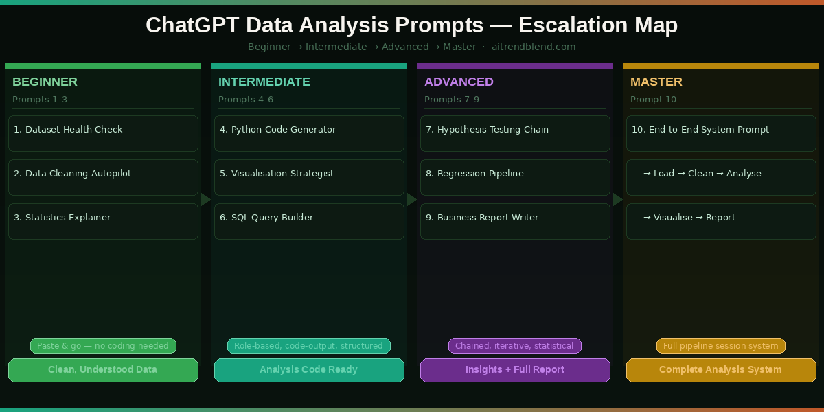
Prompts 1–6 give you clean data, descriptive statistics, custom Python analysis code, visualisations, and SQL queries. The advanced prompts below build toward full statistical testing, automated reporting, and a complete end-to-end data analysis system. Make sure Advanced Data Analysis is enabled before continuing.

“The goal is to turn data into information, and information into insight. ChatGPT handles the translation — but the question you ask still determines the answer you get.”

— Adapted from Carly Fiorina’s frequently quoted principle on data leadership

Prompt 7: The Statistical Hypothesis Testing Guide

Advanced Python

Hypothesis testing is where data analysis gets genuinely misused — p-hacking, inappropriate test selection, assumptions that go unchecked. This chained prompt first helps you choose the right statistical test for your question, then checks whether your data meets the assumptions for that test, and only then runs it. That three-step validation process is what separates a defensible statistical conclusion from an embarrassing one that gets flagged in peer review or a board presentation.

Prompt 7 — Statistical Hypothesis Testing (3-Step Chain)# STEP 1 — Send this first. Wait for the recommendation before running any test. STEP 1: Test Selection I want to test this hypothesis: [YOUR HYPOTHESIS, e.g. “Customers who received the discount email have a higher average order value than those who did not”] My data structure: – Independent variable: [VARIABLE AND TYPE] – Dependent variable: [VARIABLE AND TYPE] – Sample size: approximately [N] rows per group Which statistical test is most appropriate? Explain why, name two alternatives, and list the assumptions I need to check before running it. — After receiving the recommendation, send STEP 2 — STEP 2: Assumption Checking Check whether my data meets all assumptions for the recommended test. Run the appropriate diagnostic tests (e.g. Shapiro-Wilk for normality, Levene’s for equal variance) and tell me whether the assumptions hold or whether I should use the non-parametric alternative. — After Step 2 output, send STEP 3 — STEP 3: Run the Test Run the [RECOMMENDED TEST] and interpret the results. Include: test statistic, p-value, effect size, and a plain-English conclusion that states whether the hypothesis is supported at the 0.05 significance level.
Why It Works

Separating the three steps prevents the most common mistake in AI-assisted statistics: jumping straight to running a t-test without checking whether the data is normally distributed. The chain forces the right sequence — choose, validate, then test.

How to Adapt It

For A/B testing scenarios (conversion rates, click-through rates), modify the dependent variable to a binary outcome and ChatGPT will automatically route toward chi-square or Fisher’s exact test rather than parametric tests designed for continuous data.

Prompt 8: The Regression Analysis and Interpretation Engine

Advanced Python

Regression is one of the most powerful and most misread tools in data analysis. Coefficients get interpreted incorrectly, multicollinearity goes undetected, and R² scores get reported without context. This prompt runs a complete regression pipeline — model building, diagnostics, interpretation — and produces output that a non-statistician can read alongside the technical summary that a statistician can verify. The result is a regression analysis that is both rigorous and communicable.

Prompt 8 — Regression Analysis PipelineAct as a quantitative analyst. Run a complete regression analysis on my dataset. Target variable (what I want to predict): [TARGET VARIABLE] Predictor variables: [LIST OF FEATURE COLUMNS] Analysis goal: [e.g. “Understand which factors most strongly predict customer churn”] # Step 1 — Pre-modelling checks – Check for multicollinearity between predictors (VIF scores) – Check correlation between each predictor and the target – Identify and flag any predictors with VIF > 5 # Step 2 — Build the model – Use scikit-learn or statsmodels (whichever gives a fuller summary output) – Split data: 80% train, 20% test, random_state=42 – Report: R², Adjusted R², RMSE on test set, and p-values for all coefficients # Step 3 — Interpret the results For each significant predictor (p < 0.05), write one sentence explaining its practical meaning: "A one-unit increase in [PREDICTOR] is associated with a [DIRECTION + MAGNITUDE] change in [TARGET], holding all other variables constant.” # Step 4 — Diagnostic plots Generate: residuals vs fitted, Q-Q plot, and a feature importance bar chart.
Why It Works

The VIF check in Step 1 prevents the model from running on correlated predictors that inflate coefficients and produce misleading results. The plain-English coefficient interpretation template forces output that is boardroom-ready, not just console-ready.

How to Adapt It

For binary target variables (churn: yes/no, conversion: true/false), change “regression” to “logistic regression” and add “Report AUC-ROC and a confusion matrix instead of R² and RMSE.” ChatGPT handles the full switch in classifier evaluation metrics seamlessly.

Prompt 9: The Business Insights Report Writer

Advanced GPT-4o / GPT-5

You have done the analysis. Now you have to write a report that a VP, a client, or a non-technical team will actually read, remember, and act on. This is the step where most analysts lose momentum — the writing. This prompt turns your analytical findings into a structured narrative report with executive summary, section breakdowns, data-backed recommendations, and clear next steps. It is the difference between sending a colleague a Python notebook and sending them something they will open.

Prompt 9 — Business Insights Report WriterYou are a business analyst writing a data insights report for senior stakeholders. Based on the analysis I have already completed in this session, write a structured report. Report context: – Dataset: [BRIEF DESCRIPTION OF DATA] – Primary question answered: [ANALYTICAL QUESTION] – Audience: [e.g. “Marketing Director and Sales VP, minimal statistical background”] – Intended action: [e.g. “Decide whether to continue the discount email campaign”] Report structure: 1. Executive Summary (150 words) — findings and recommendation only, no methodology 2. Key Findings (3–4 bullet points, each with a supporting data point) 3. Analysis Detail (2–3 paragraphs — what was done and what it showed, accessible language) 4. Limitations (1 paragraph — honest about what the data cannot tell us) 5. Recommendations (2–3 specific, actionable steps with a brief rationale each) 6. Next Steps (what data or analysis would strengthen confidence in these recommendations) # Tone: confident but not overstated. Use hedging where appropriate (“suggests”, “indicates”). # Avoid jargon. Define any technical terms you must use.
Why It Works

The audience description and intended action fields are the two most important inputs. They stop the model from producing a generic research summary and push it toward a decision-support document — which is what business stakeholders actually need from a data report.

How to Adapt It

For academic or technical audiences, swap “minimal statistical background” for “quantitative research background” and remove the “avoid jargon” instruction. The model scales its register precisely based on the audience description, so a small change produces very different prose.

Prompt 10: The End-to-End Data Analysis System Prompt

Master Python SQL

This is the prompt you paste at the start of any serious data analysis session. It turns ChatGPT into a persistent data analysis partner that knows your dataset, your goals, your technical stack, and your output requirements before you ask a single analytical question. Think of it as configuring the environment before opening a Jupyter notebook — except the environment remembers your business context, not just your kernel state. Once this is set, every subsequent prompt in the session builds on a shared foundation rather than starting from scratch.

Prompt 10 — End-to-End Data Analysis System Prompt# PASTE THIS AT THE START OF EVERY DATA ANALYSIS SESSION # Adjust the details below for each new project You are my data analysis partner for this session. You understand data science, statistics, SQL, Python, and business communication. You know the following about my project: # PROJECT CONTEXT Dataset: [BRIEF DESCRIPTION OF DATA + DOMAIN] Business question: [WHAT DECISION OR INSIGHT ARE WE TRYING TO PRODUCE?] Technical stack: [Python/pandas, SQL dialect, BI tool if any] Audience for outputs: [TECHNICAL / BUSINESS / MIXED] Deadline pressure: [HIGH / MEDIUM — affects how much you explain vs just produce] # BEHAVIOUR RULES FOR THIS SESSION – When I say “analyse [X]”, run the analysis and show code + output + 2-sentence interpretation – When I say “explain [X]”, give a plain-English explanation without code – When I say “code for [X]”, give clean Python code only — no prose – When I say “report on [X]”, produce a business-ready summary (no code) – Always flag if a question cannot be answered reliably from this dataset alone – Never invent data or fabricate statistics — use [?] to flag where real data is needed – If I ask something ambiguous, ask one clarifying question before proceeding # QUALITY STANDARDS – All charts: 10×6 inches, insight-driven titles, labelled axes with units – All statistical claims: include effect size and confidence interval, not just p-value – All code: handle NaN values explicitly, add section comments, final print summary – All reports: executive summary first, recommendations specific and actionable I have uploaded my dataset. Please confirm you can see it and give me a one-paragraph overview of what it contains.
Why It Works

The command protocol (analyse / explain / code / report) is what makes this a system prompt rather than a one-shot request. It creates a shared vocabulary for the session so you can issue short, fast instructions and get precisely the output format you need without re-specifying requirements every time. The [?] flag instruction prevents statistical hallucination.

How to Adapt It

Save this as a text snippet in your productivity tool of choice and paste it at the start of every new data project. The only things that change project-to-project are the five fields in the PROJECT CONTEXT block. The behaviour rules and quality standards stay constant — they represent your personal analytical standards, not a project-specific detail.

Common Mistakes and How to Fix Them

The prompts above work well when used correctly. Here are the five mistakes that consistently produce bad results — and the exact fix for each one.

Mistake 1 — Forgetting to upload the file. If you ask ChatGPT to “analyse my sales data” without attaching a file, it invents a plausible-looking analysis using fictional numbers. Always attach before prompting. If you see numbers in the output that you cannot trace back to your data, that is a sign ChatGPT is hallucinating rather than computing.

Mistake 2 — Asking for charts without specifying the insight. “Make a chart of revenue by month” produces a generic chart. “Make a chart that clearly shows whether Q4 revenue recovered after the August dip” produces a chart designed to answer a question. The framing difference is small; the output difference is significant.

Mistake ❌ Wrong Approach ✅ Right Approach
No file uploaded “Analyse my customer data” Upload CSV first, then: “Analyse the uploaded customer data. Show me the output.”
Vague chart request “Make me a bar chart” “Make a chart that shows which product categories declined in Q4. Use insight-driven title.”
Skipping assumptions “Run a t-test on these two groups” “Check normality and equal variance first, then recommend and run the appropriate test.”
Trusting all statistics Accept p-values and R² at face value Ask: “What are the limitations of this result? What could make it unreliable?”
One-shot reports “Write a report about my data” Use Prompt 9 with full context: audience, intended action, and the specific findings to include.

What ChatGPT Still Struggles With for Data Analysis

None of this works perfectly all the time, and the failure modes for data analysis are worth naming explicitly because some of them can produce results that look correct but are not.

The most serious limitation is what happens with very large datasets. Advanced Data Analysis has memory and file size constraints — if your CSV exceeds roughly 50MB or has more than a few hundred thousand rows, the session can time out, truncate the data without warning, or slow to unusable speeds. For genuinely large-scale analysis, ChatGPT is best used to write the code that you then run locally in your own environment, not to run the analysis itself inside the chat session.

The second limitation is domain-specific statistical nuance. ChatGPT handles standard statistical tests reliably but can give overconfident answers about edge cases in specialised domains — survival analysis in clinical trials, panel data models in econometrics, time-series models with structural breaks. If you are working at the frontier of a technical statistical discipline, treat ChatGPT as a starting point for your code and always have someone with domain expertise review the methodology. A good test: if ChatGPT does not spontaneously flag the key assumptions of the test you asked for, probe further before relying on the result.

Finally, ChatGPT cannot access live databases or real-time data feeds. Every analysis runs on data you have already exported and uploaded. For dashboards, live reporting, or continuous monitoring workflows, ChatGPT is a code generator for those pipelines — not the pipeline itself. Build the analysis logic with ChatGPT, then implement it in your own infrastructure.

Make Your Data Talk — One Prompt at a Time

What you have in these ten prompts is a structured progression from raw data to clean data, clean data to insight, insight to statistical validation, and validation to communication. That is the entire data analysis workflow — compressed into a set of prompts you can adapt to almost any dataset, domain, or business question. The escalation matters: Prompts 1–3 build the foundation, Prompts 4–6 run the core analysis, Prompts 7–9 handle rigour and reporting, and Prompt 10 turns every future session into a smooth, context-aware collaboration.

There is something deeper worth saying about what these prompts reflect. Good data analysis has always been partly a communication problem — the challenge of translating numbers into decisions. ChatGPT does not replace the analytical judgment that determines which questions matter. But it dramatically reduces the technical friction between having a question and getting a rigorous, communicable answer. For anyone who has stared at a pandas error for forty minutes or rewritten a stakeholder report three times because “it was too technical,” that friction reduction is genuinely valuable.

There are things these prompts cannot give you. They cannot replace domain expertise — an analyst who understands their industry will always ask better questions than one who does not. They cannot replace critical thinking about whether the data you have actually answers the question you are asking. And they cannot replace the judgment calls that happen when your findings are uncomfortable and someone needs to decide whether to act on them anyway. Those remain human responsibilities, and they are the ones that matter most.

ChatGPT’s data analysis capabilities are improving with each model update, and GPT-5’s improved long-context reasoning already makes multi-step analytical sessions noticeably more coherent than they were a year ago. The direction of travel — toward AI that can maintain analytical context across a full project rather than resetting with each conversation — suggests that the Prompt 10 system approach will become the standard way serious analysts work with AI in the next twelve to eighteen months. Start building that habit now, and you will be ahead of the curve when the tools catch up to the workflow.

Start Analysing Your Data Right Now

Open ChatGPT with GPT-4o or GPT-5, enable Advanced Data Analysis, upload your dataset, and paste Prompt 10’s system context. Your data has a story — let’s help you find it.

All prompts tested on ChatGPT (GPT-4o and GPT-5 with Advanced Data Analysis) as of March 2026. Statistical outputs depend on uploaded data quality and may vary. Always validate critical analytical results independently. This article is original editorial content by AITrendBlend.com and is not affiliated with OpenAI.

© 2026 AITrendBlend.com · AI Tools Reviews, Prompts & Guides · Independent editorial content. Not affiliated with OpenAI or any AI company.

Leave a Comment

Your email address will not be published. Required fields are marked *

Follow by Email
Tiktok