
Key points
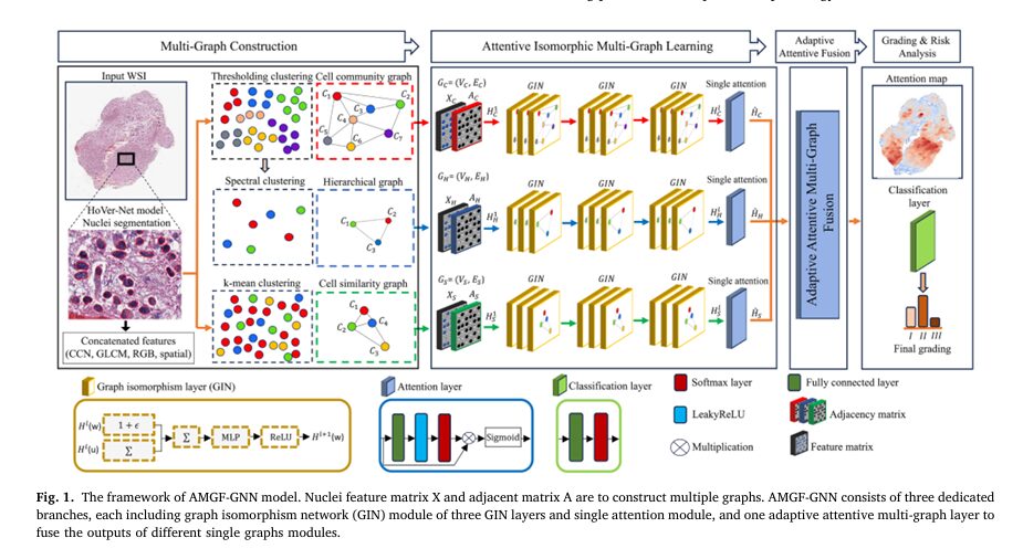
- AMGF-GNN builds three separate graphs from the same set of segmented nuclei, one grouped by spatial community, one grouped hierarchically at the cluster level, and one grouped by feature similarity.
- Each graph is processed by its own three layer graph isomorphism network branch, then passed through a node level attention gate before fusion.
- A shared attention vector learns how much weight to give each of the three graphs per slide, rather than fusing them with a fixed rule.
- A dual level loss keeps the three graph embeddings consistent with each other, both within a single graph and across the three graphs, on top of the ordinary classification loss.
- On the glioma dataset the model reached 89.68 percent accuracy for the two grade problem and 87.52 percent for the three grade problem, and on the breast cancer dataset it reached 81.82 percent accuracy across three grades, ahead of HACT-Net, Graph-Transformer, CGC-Net and several other published baselines.
The problem this paper is actually trying to solve
Cancer grading sounds like a simple counting exercise. Look at how abnormal the cells are, assign a number, done. In practice grading is closer to reading a crowded room and trying to describe its social structure at three different zoom levels simultaneously. A single abnormal looking cell means little on its own. What matters is whether that cell sits inside a dense, disorganized neighborhood, whether that neighborhood connects to other disorganized neighborhoods across the slide, and whether the cell resembles other clearly malignant cells in shape and texture. Deep convolutional networks are good at the first kind of local pattern and weak at the second and third, because a convolution only sees a fixed local window and has no natural way to represent a cell’s relationship to cells far away on the same slide.
Graph based models were built to close that gap. Treat each nucleus as a node, connect nearby or similar nuclei with edges, and let a graph neural network pass messages between them. That idea has been around for several years now, and the authors themselves published an earlier single graph system called PathoGraph for survival prediction in glioma. The trouble the new paper identifies is more specific than most prior graph work is willing to admit. A single graph, no matter how it is built, only captures one relational view of the tissue. Build the graph from spatial proximity and you get a good picture of tumor architecture but you lose information about which cells actually look alike under the microscope. Build it from feature similarity instead and you get the opposite trade. Pick one graph and you have already thrown away information the other graph would have kept.
Several groups tried to fix this by stacking graphs hierarchically, cell level graphs feeding into tissue level graphs through learned pooling. That helps, but it still usually treats the different levels with fixed or equal weighting, and the paper argues that fixed weighting is exactly backward for a task like grading, where the relative importance of spatial structure versus feature similarity plausibly changes from one cancer type to another and possibly from one slide to another. The paper’s own experiments later back this claim up in an interesting way, community structure turns out to matter more for glioma while similarity structure matters more for the breast cancer dataset, and a fixed fusion rule would have had no way to discover that difference on its own.
Prior graph based approaches to pathology grading
The related work section of the paper is worth summarizing on its own terms because it traces a real lineage of ideas rather than a list of citations. Early cell level graph work, exemplified by Zhou and colleagues’ CGC-Net, used nuclei as nodes and spatial proximity as edges to grade colorectal cancer, and that basic recipe of nucleus as node became the default starting point for almost everything that followed. Aygunes and colleagues moved up a level, using patches rather than individual cells as nodes for weakly supervised region classification in breast tissue. Su and colleagues tried masking the nucleus itself out of the feature patch to force the network to rely on surrounding context. Lu and colleagues built a whole slide graph using the HoVer-Net segmentation model, the same nucleus detector AMGF GNN itself relies on, to model inter nuclear distances across an entire slide.
A second wave of work pushed toward hierarchy on purpose, trying to mimic how a pathologist zooms out from cell to tissue. Pati and colleagues’ HACT-Net links a cell graph to a separate tissue graph through a learned assignment matrix, letting information propagate upward from individual cells to larger structures. Ying and colleagues’ earlier and more general DiffPool method, not built for pathology specifically, showed that a graph network could learn its own hierarchical pooling rather than being told the hierarchy in advance, and that idea has been adapted into histopathology repeatedly since. Ding and colleagues’ fractal design ran multiple GNN paths of different depths in parallel specifically to encode different levels of granularity, which is conceptually close to what AMGF GNN does, though AMGF GNN’s three branches differ in graph construction rather than in depth.
What almost none of this earlier work does is treat the choice between spatial, feature based, and hierarchical views as something the model itself should weigh dynamically per sample. That is the specific gap AMGF GNN is aimed at, and it is a narrower and more falsifiable claim than most cancer AI papers make. The paper tests it directly by running each of its three graphs alone through the same pipeline, and the ablation numbers, which are the most useful part of the paper for a skeptical reader, back the claim up reasonably well.
Where CTransPath, UNI and foundation models fit in
The paper also nods toward large pretrained pathology foundation models such as CTransPath and UNI, trained with self supervised learning on enormous slide collections, and notes candidly that its own approach is orthogonal to that trend rather than competing with it. AMGF GNN builds graphs from handcrafted and CNN derived features rather than foundation model embeddings, and the authors flag integrating a foundation model’s embeddings as future work rather than something they have already done. That is a fair and modest framing, and it matters for anyone deciding how to read the accuracy numbers later in this article, since a foundation model backbone could plausibly move those numbers again in either direction.
How the three graphs are actually built
Before any graph exists, the pipeline runs a pretrained HoVer-Net model over each whole slide image to segment individual cell nuclei and locate their centroids. HoVer-Net earns its name from using the horizontal and vertical distance of each nuclear pixel to its own center of mass, which lets it separate touching or overlapping nuclei more cleanly than a plain segmentation mask would. Class labels from HoVer-Net are discarded on purpose, since the authors wanted the graph construction to generalize across datasets rather than depend on a fixed cell typing scheme.
Each detected nucleus then gets a 566 dimensional feature vector built from four ingredients. A 512 dimensional ResNet feature vector pretrained on ImageNet, extracted from a 72 by 72 pixel patch centered on the nucleus. A 50 dimensional gray level co occurrence matrix feature capturing texture, computed in horizontal and vertical directions at a 5 by 5 window. A 3 dimensional average RGB intensity feature from the same patch. And a single scalar counting how many neighboring nuclei that cell has, as a crude but useful density signal. Stack every nucleus in a slide and you get a feature matrix with one row per cell and 566 columns.
The cell community graph
The first graph groups spatially neighboring nuclei using thresholding clustering, merging cells within a fixed distance of each other, 500 pixels for the glioma dataset and 250 pixels for the breast cancer dataset in the authors’ tuned setting. Each resulting cluster becomes a node in the community graph, with the node’s position set to the average centroid of its member cells and the node’s features set to the average feature vector of those same cells. Edges are then added between clusters using a k nearest neighbor rule. This graph is essentially a compressed map of local tumor architecture, cells that physically cluster together on the slide.
The hierarchical graph
The second graph takes the community clusters from step one and clusters them again, this time using spectral clustering based on feature similarity between cluster centroids rather than spatial proximity. This produces a smaller set of higher level clusters that summarize population level structure across the whole slide, closer to how a pathologist might describe regional patterns rather than individual neighborhoods. Nodes and edges are built the same way as the community graph, average centroid and average features per node, k nearest neighbor edges between nodes.
The cell similarity graph
The third graph ignores spatial position almost entirely. It computes the cosine similarity between the 566 dimensional feature vectors of every pair of nuclei, then runs k means clustering directly on those similarities to group cells that look alike regardless of where they sit on the slide. This graph is the one most likely to catch a small number of unusual, highly malignant looking cells scattered across an otherwise ordinary looking slide, precisely the kind of signal that a purely spatial graph could miss.
Why three graphs instead of one bigger graph
A natural question is why not just build one large graph with every kind of edge mixed together. The paper’s implicit answer, supported by the later ablation results, is that mixing relational types into one graph forces a single graph neural network to learn one shared notion of what an edge means, when spatial proximity and feature similarity are genuinely different kinds of relationships that call for different message passing behavior. Keeping them separate until a dedicated fusion layer lets each branch specialize.
The network architecture in detail
Each of the three graphs feeds its own dedicated branch, and the three branches never share weights during the graph isomorphism network stage. This is a deliberate choice the authors make explicit, since it lets gradients flow through three different routes and, in their account, converge faster without adding parameters relative to a single shared branch.
Graph isomorphism network layers
Each branch stacks three graph isomorphism network, or GIN, layers. GIN updates a node’s embedding by combining its own previous embedding with the sum of its neighbors’ embeddings, scaled by a small learnable parameter, then passing that combination through a multilayer perceptron. Written out, the update rule for node w at layer l is
where V stands for whichever of the three graphs is being processed, community, hierarchical or similarity, and N sub V of w is the set of neighboring nodes of w in that particular graph. The epsilon term controls how much a node trusts its own previous state relative to what its neighbors are telling it, and it is learned rather than fixed, which lets each branch tune that balance independently.
Single graph attention
After the three GIN layers finish, each branch passes its node embeddings through a node level attention gate before anything gets fused across branches. The idea is that not every node in, say, the cell similarity graph deserves equal weight when the branch’s output gets summarized. A cluster of ordinary looking cells should count for less than a cluster that looks unusual. The attention coefficient for node i in the similarity branch is computed as
and the gated node embedding is then formed by scaling the raw embedding by that coefficient and passing the result through a sigmoid
The same operation runs independently on the community and hierarchical branches with their own learned weights, so each branch develops its own sense of which nodes matter for that particular relational view.
Adaptive attentive multi graph fusion
This is the component the paper spends the most effort motivating, and it is genuinely the most interesting engineering choice in the architecture. Rather than concatenating the three gated embeddings or averaging them with a fixed weight, the fusion layer runs each branch’s embedding through a shared nonlinear transformation and a shared attention vector q, learning one attention score per graph rather than per node at this stage. For the similarity branch that score is
and after computing the equivalent score for the community and hierarchical branches, a softmax normalizes the three scores against each other so they sum to one across every branch and every node jointly
The resulting weights are packed into diagonal matrices, one per branch, and the final unified graph embedding H is a weighted sum of the three gated embeddings
Because q, W and b are shared across all three branches rather than learned separately per branch, the model is forced to compare the three graphs on a common scale rather than learning three independent, incomparable notions of importance. That sharing is what lets the same attention vector output a genuinely interpretable per graph weight, which the authors then use directly as a risk analysis tool later in the paper, not just as an internal mechanism.
The dual level loss function
Classification accuracy alone does not guarantee that the three branch embeddings are actually saying something consistent about the same slide. The authors add a second loss term meant to police that consistency directly, on top of the ordinary cross entropy grading loss.
After L2 normalizing each branch’s node embeddings, the model computes a similarity matrix within each graph, comparing every node in that graph to every other node in the same graph. Averaging the three resulting similarity matrices produces a reference matrix, and an intra graph loss penalizes each branch for deviating from that shared reference. A second, inter graph term compares nodes across different branches to each other and penalizes asymmetry between, for instance, how the community branch sees a pair of nodes versus how the similarity branch sees the same pair. Both terms are combined into one consistency loss, which is then added to the standard cross entropy grading loss with a small weighting factor alpha in front of the consistency term and a larger weighting factor beta in front of the grading term.
The authors report tuning alpha and beta over a standard grid and landing on alpha at one thousandth for the glioma dataset and one ten thousandth for the breast cancer dataset, with beta fixed at one in both cases. That is a meaningful detail on its own. The grading loss dominates optimization by a wide margin, and the consistency loss functions as a light regularizer rather than a primary objective, which the authors note explicitly, adding that larger alpha values tended to destabilize training rather than improve it.
Experimental results
The model was evaluated on two public datasets. A glioma cohort of 654 usable whole slide images from 490 patients, drawn from The Cancer Genome Atlas through the Genomic Data Commons, split into a binary low grade versus glioblastoma task and a three class task that keeps grade two and grade three separated within the low grade group. And a breast cancer cohort of 922 images from 124 patients with invasive ductal carcinoma, using only the 40x magnification images and their three grade labels. Results below are accuracy and F1 score averaged over five runs with different random seeds, as reported in the paper.
| Model | Glioma, two grade, accuracy | Glioma, three grade, accuracy | Breast IDC, three grade, accuracy |
|---|---|---|---|
| ResNet-50 | 84.26 | 83.85 | 73.65 |
| CGC-Net | 84.40 | 82.28 | 75.55 |
| Graph-Transformer | 86.02 | 85.60 | 79.01 |
| HACT-Net | 87.42 | 86.78 | 78.60 |
| PathoGraph, the authors’ earlier single graph model | 85.78 | 83.45 | 77.31 |
| AMGF GNN, this paper | 89.68 | 87.52 | 81.82 |
The gap over HACT-Net, arguably the strongest and most conceptually related prior model since it also connects cell level and tissue level information, is a bit over two points on the binary glioma task and a bit over three points on the breast cancer task. That is a real but not enormous margin, and it is worth reading against the fact that HACT-Net uses a fixed assignment matrix to link its two graph levels while AMGF GNN learns its fusion weights per sample, which is the specific mechanism the paper is arguing for.
What the single graph ablations actually show
The more informative table in the paper, for a reader trying to judge whether the added complexity is earning its keep, is the ablation that runs each graph alone through the same pipeline. On glioma, the cell community graph reaches 85.39 percent accuracy on its own, meaningfully ahead of the hierarchical graph’s 68.83 percent and the similarity graph’s 78.52 percent. On the breast cancer dataset the ranking flips, the similarity graph outperforms the community graph, 78.62 percent against 75.59 percent. Combining any two graphs already closes most of the gap to the full three graph fusion, and the full model with all three graphs and both attention mechanisms still adds a further few points on top of any two graph combination.
The hierarchical graph, notably, performs worst as a standalone model on both datasets by a wide margin, yet the authors report that removing it from the full fusion still hurts performance, which is a claim the paper makes but does not show a table for as directly as it does the single graph results. Taken at face value it suggests the hierarchical view contributes something complementary even when it is weak on its own, though a reader should treat that particular claim as somewhat less rigorously demonstrated than the headline comparison table.
The attention mechanism ablation
A separate ablation strips out first both attention mechanisms, then just the multi graph fusion attention, then restores both. Without either attention mechanism accuracy sits at 84.19 percent on the binary glioma task. Adding single graph attention alone brings that to 85.45 percent. Adding multi graph fusion attention on top of single graph attention brings the full model to 89.68 percent, the largest single jump in the whole ablation table. That four point jump from adding the fusion attention is the strongest piece of evidence in the paper that adaptive weighting across graphs, rather than just better per graph representations, is doing real work.
What the attention weights reveal about the two cancer types
Because the fusion layer’s attention weights are interpretable per graph, the authors track how much weight each of the three graphs receives on average, separately for glioma and for breast cancer. On glioma the community graph consistently receives the highest attention, followed by similarity, with the hierarchical graph trailing. On the breast cancer dataset that pattern reverses, similarity receives the highest weight. Watching those weights over the course of training shows all three starting close to equal early on and then diverging as training proceeds, which the authors read as the model discovering, rather than being told, which relational view matters more for a given cancer type.
The paper also visualizes node level attention overlaid back onto the original slides as heatmaps, and reports that higher grade glioblastoma slides show attention concentrated over a broader fraction of the tissue, roughly 28 percent of nodes in the top attention band for grade four slides against roughly 9 percent for grade two slides. That pattern lines up with the ordinary pathological expectation that higher grade tumors show more widespread structural disruption rather than isolated pockets of abnormal tissue, and it is a reasonable sanity check on whether the attention weights are tracking something biologically sensible rather than an artifact of the training process.
A caution about reading attention as explanation
Attention weights are a useful diagnostic tool and the paper’s own sanity checks against known pathology are a responsible way to use them. They are not, on their own, proof that the model is reasoning the way a pathologist reasons, and the paper does not claim they are. Treat the heatmaps as evidence the model’s internal weighting correlates with known disease severity patterns, not as a validated explanation of the model’s decision process.
Clinical translation gap
There is a meaningful distance between an 89.68 percent accuracy figure on a curated, publicly available research dataset and a tool that a hospital pathology department could actually use. The glioma cohort here, 654 slides after excluding corrupted or poorly resolved images, is a research grade selection from The Cancer Genome Atlas, collected and curated for research purposes rather than sampled the way slides arrive in a working clinical pipeline. A real deployment would need to handle scanner variation across hospitals, staining variation, artifacts, and patient populations that were not represented in the training data at all. The paper does not present any external validation on a separate hospital cohort, and does not claim to. It also does not report calibration, meaning how well the model’s confidence scores match its actual error rate, which matters a great deal if a tool like this were ever used to flag cases for prioritized review rather than simply to output a grade. None of this is a flaw specific to this paper, it is the normal state of computational pathology research at this stage, but it is worth stating plainly rather than letting an impressive accuracy number imply more readiness than the paper itself claims.
The authors’ own runtime figures are also relevant to translation. Training took roughly two and a half to three and a half hours per dataset on a single RTX 3090 GPU, and inference on a single slide took around two to three seconds, which is fast enough to be practically usable if the accuracy and generalization questions above were resolved. The nuclear segmentation step, run separately through HoVer-Net before any graph construction begins, is itself a potential source of error that would compound with whatever the graph network gets wrong afterward, and the paper’s accuracy numbers implicitly assume that upstream segmentation step performs well.
Honest limitations
The paper states its own scalability concern directly, noting that AMGF GNN faces scalability challenges with larger datasets because of the added cost of building and processing three separate graph structures per slide rather than one. The authors report a 35 to 40 percent increase in training time relative to a single graph baseline, which is a real and quantified cost for the roughly two to three point accuracy gain shown in the comparison table.
Sample size is modest by deep learning standards, 654 usable glioma slides from 490 patients and 922 breast cancer images from 124 patients. Five run averaging with different random seeds is a reasonable way to check training stability, but it does not substitute for an external validation cohort collected at a different institution, and the paper does not include one. The breast cancer dataset in particular comes from a single source with 124 patients, a small enough number that grade specific subgroup performance could be noisy in ways the aggregate accuracy figure does not reveal.
The authors also flag, appropriately, that further validation against expert pathologist annotations is still needed to establish clinical relevance, which is a more cautious statement than many papers in this space are willing to make, and is worth taking at face value rather than reading past it.
Key takeaway
The strongest evidence in this paper is not the headline accuracy number against nine baselines, it is the ablation showing a four point jump specifically from adding the multi graph fusion attention on top of everything else. That result targets the paper’s actual claim, that adaptive weighting across relational views beats a fixed fusion rule, more directly than the leaderboard comparison does.
Where this points next
The authors list several concrete next steps rather than a vague call for future work. Dynamic graph generation to improve scalability. More efficient message passing between hierarchy levels. Simpler hierarchical construction methods that might recover most of the benefit without the current computational overhead. And, notably, integrating pretrained foundation model embeddings such as CTransPath or UNI in place of the current handcrafted and ResNet based node features, which the discussion section flags as a promising direction without claiming to have tried it. Given how much foundation model pretraining has changed other corners of computational pathology recently, that specific combination, a learned adaptive fusion mechanism sitting on top of foundation model node features rather than ResNet features, seems like the most obvious next experiment for anyone trying to build directly on this work.
Conclusion
What AMGF GNN gets right is a fairly narrow but well tested claim, that letting a model learn how much to trust spatial community structure versus feature similarity structure, per slide, beats deciding that balance in advance or fixing it once for an entire dataset. The ablation tables back that claim up more convincingly than the headline leaderboard numbers do, and the fact that the learned attention weights land on different answers for glioma and for breast cancer, matching what a pathologist might independently expect from those two tissue types, is a genuinely useful piece of evidence that the mechanism is doing something real rather than just adding parameters.
The conceptual shift here is small but real. Most prior multi graph work in pathology treated hierarchy or multiple relational views as something to be fused with a fixed rule decided by the researcher in advance. This paper treats that fusion weight as one more thing the model should learn from data, the same way attention mechanisms elsewhere in deep learning replaced fixed pooling and fixed alignment rules. That is a pattern with obvious room to generalize beyond tumor grading specifically, to any task where a system needs to combine several structurally different representations of the same underlying object and the right balance between them is not knowable in advance.
Whether that idea transfers cleanly outside histopathology is an open question the paper does not test, but nothing about the fusion mechanism itself is specific to cells or tissue. The same shared attention vector approach could plausibly weight, say, a molecular graph against a spatial graph in a different biomedical imaging task, or weight different sensor modalities in an entirely unrelated domain, and the paper’s own discussion section gestures toward exactly that kind of transfer when it mentions a separate foundation model for inertial signals as a loosely related precedent.
The honest limitations are worth restating rather than glossing over. No external hospital validation, a training time cost of 35 to 40 percent over a single graph baseline, modest sample sizes on both datasets, and an explicit acknowledgment from the authors themselves that expert pathologist validation is still needed before any clinical relevance can be claimed. None of that undermines the specific architectural claim the paper is making, but it does mean the accuracy numbers should be read as evidence for a method, not as a finished clinical tool.
The next real test for this line of work is not a bigger accuracy number on the same two datasets. It is whether the adaptive fusion idea still holds up once the node features come from a large pretrained pathology foundation model instead of a ResNet, and whether the learned attention weights still land on sensible, dataset appropriate answers once the model is asked to generalize across hospitals rather than within one curated cohort.
Frequently asked questions
What does AMGF GNN actually stand for
Adaptive Multi Graph Fusion based Attentive Graph Neural Network. Each part of the name maps to a real component, adaptive and attentive both refer to the fusion layer that learns how much weight to give each of the three graphs, and multi graph refers to the three separate graph views built from the same set of segmented cells.
Does this model diagnose cancer
No. It assigns a grade to tissue that has already been identified as tumor and already imaged as a digital whole slide. Diagnosis itself, deciding whether tissue is cancerous in the first place, is a separate clinical process performed by pathologists and is outside what this paper attempts.
How much better is AMGF GNN than a single graph model
On the glioma binary grading task, the strongest single graph baseline reported in the paper, the cell community graph on its own, reached 85.39 percent accuracy against the full model’s 89.68 percent, a gap of a bit over four points. The gap varies by dataset because different graphs carry different relative amounts of useful information for glioma compared to breast cancer.
What datasets was the model trained and tested on
A glioma cohort of 654 whole slide images from 490 patients drawn from The Cancer Genome Atlas, and a breast cancer cohort of 922 images from 124 patients with invasive ductal carcinoma. Both are publicly available research datasets, and the paper does not report testing on any separate hospital cohort.
Is the code from this paper publicly available
The paper itself does not include a link to a public code repository in the text provided here. Readers who need the original implementation should check the journal page or contact the corresponding author directly rather than assume a repository exists.
What is the biggest limitation of this study
The authors themselves point to two, a scalability cost of roughly 35 to 40 percent longer training time from processing three graphs instead of one, and the absence of validation against expert pathologist annotations or an external hospital cohort, which they state is still needed before any claim of clinical relevance would be justified.
Read the full paper for the complete mathematical derivations, additional ablations on the KNN neighbor count and clustering distance parameters, and the attention heatmap figures in context.
Academic citation. Alzoubi, I., Xin, B., Bjerkvig, R., Wang, J., Wang, X. An adaptive multi graph fusion for tumor grading in pathology images. Pattern Recognition, volume 171, 2026, article 112214. https://doi.org/10.1016/j.patcog.2025.112214. Published under a CC BY 4.0 license.
This analysis is based on the published paper and an independent evaluation of its claims.
Hello aitrendblend.com Webmaster.