
Key points
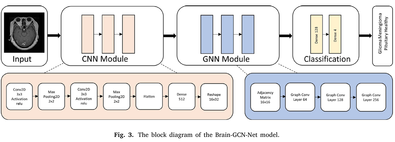
- Brain GCN Net stacks two convolution and pooling blocks, reshapes the resulting features into a sixteen node graph, and runs three graph convolution layers before a final classifier, reaching 93.68 percent accuracy on a four class MRI dataset of 10847 images.
- The paper’s own confusion matrix and Table 2 both put overall accuracy at 93.68 percent, yet one paragraph in the results section states 97.61 percent for the same model. Only the lower figure is consistent with the reported numbers.
- The results narrative singles out pituitary tumors as the class the model struggles with, but the per class table shows pituitary as the best performing class at 99.29 percent, while glioma and meningioma are the two classes carrying almost all of the errors.
- The architecture table lists the graph convolution layers with a three dimensional activation map that does not follow logically from the two dimensional tensor the reshape step produces, leaving the exact node feature width for an implementer to infer.
- Class balance across the merged dataset is reasonably even, between 2431 and 3018 images per class, which is a genuine strength most brain tumor papers built on a single smaller dataset cannot claim.
- A working PyTorch reimplementation, included below with a runnable smoke test, shows the model trains end to end and clarifies the graph construction choices the paper leaves unspecified.
Why fuse a graph network with a convolutional one at all
Convolutional networks are very good at one specific job. They slide a small filter across an image and learn to notice edges, textures, and shapes wherever those patterns show up. That translation invariance is exactly why CNNs have dominated medical image classification for a decade. But a CNN, on its own, treats each patch of the image mostly in isolation from patches that are far away. A tumor that has spread, or a lesion whose shape only makes sense in relation to a structure on the other side of the brain, can be hard for a purely convolutional model to reason about without very deep stacks of layers.
Gursoy and Kaya’s argument, laid out early in the paper, is that graph neural networks fill exactly that gap. A graph represents a scene as nodes and edges rather than a fixed grid, so a node can be connected to any other node regardless of pixel distance, and the network learns which connections matter through message passing. The authors point to prior GNN work in drug discovery and electronic health record analysis as evidence that relational modeling pays off once you move past simple grid structured data. For brain MRI specifically, they reason that tumor regions often interact with surrounding tissue in ways a purely local filter will miss, and a graph layer sitting after the CNN can pick up on that broader structure.
It is worth being honest about how thin this specific medical justification is in the paper itself. The introduction cites general GNN success stories from unrelated domains more than it cites evidence that graph structure specifically improves brain tumor MRI classification. The real test, then, is whether the numbers back up the architectural intuition, which is where the rest of this analysis focuses.
The dataset behind the numbers
One thing the paper does well is dataset construction. Rather than relying on a single small collection, the authors combined two public Kaggle datasets. The first contributes 1945 meningioma images, 1321 glioma images, 1757 pituitary images, and 2000 healthy scans. The second adds 1073 meningioma, 1110 glioma, 1109 pituitary, and 532 healthy images. Added together that comes to 3018 meningioma, 2431 glioma, 2866 pituitary, and 2532 healthy images, a total of 10847.
That is a genuinely balanced spread, each class sitting between roughly 2400 and 3000 images, which matters more than it might sound. A lot of published brain tumor classifiers train and report accuracy on datasets where one class dominates, which inflates accuracy without meaning much for the minority class. Here the four classes are close enough in size that accuracy is a reasonably fair summary metric, though as we will see the per class numbers still tell a different story than the headline figure.
Preprocessing followed a fairly standard pipeline. Images were rescaled so pixel intensities sit between zero and one, resized to 224 by 224 pixels using a proportional coordinate mapping, converted from grayscale to a three channel format by copying the same intensity into the red, green, and blue channels, and cropped to remove black borders that would otherwise add noise. None of this is unusual and all of it is reasonable. The one detail worth flagging for anyone trying to reproduce the pipeline is that combining T1 contrast weighted, T2 weighted, and FLAIR sequences into one training set, without any sequence identifier fed to the model, means the network has to learn to be robust to differences between MRI sequences implicitly rather than being told which sequence it is looking at.
How the architecture actually works
The full pipeline, as described in Section 3.4 and Table 1 of the paper, runs in three stages.
The CNN stage
A rescaling layer takes the 224 by 224 by 3 input and normalizes it. A first convolution layer with 64 filters and a 3 by 3 kernel produces a 222 by 222 by 64 feature map, followed by a 2 by 2 max pool that halves the spatial size to 111 by 111. A second convolution, again 64 filters, brings the map to 109 by 109 by 64, and a second max pool reduces it to 54 by 54 by 64. That tensor is flattened and passed through a dense layer of 512 units with a rectified linear activation.
The bridge into graph space
This is the part that deserves the most scrutiny. The 512 dimensional dense output is reshaped into a 16 by 32 tensor, which the paper treats as sixteen graph nodes, each carrying a thirty two dimensional feature vector. An adjacency matrix is then built and fed, along with the node features, into the graph convolution stack. Equation 26 in the paper defines the adjacency entries through a membership condition between feature sets, but the condition as written is ambiguous enough that two different readers could implement two different graphs from it. Our own reimplementation, described below, makes an explicit choice, a fully connected graph with symmetric normalization, and says so rather than pretending the paper settled the question.
The graph convolution stage
Three graph convolution layers follow the layer wise propagation rule the paper writes as P at layer l plus one equals a rectified linear activation applied to the normalized adjacency matrix multiplied by the previous layer’s features and a trainable weight matrix. The channel width grows from the node input width up to 64, then 128, then 256 across the three layers. A max pool along the node axis collapses the sixteen node representations into one 256 dimensional vector, which passes through a dense layer of 128 units and then a final four unit output layer for the four classes.
Here \(\hat{A}\) is the normalized adjacency matrix built from the degree matrix, \(P^{(l)}\) is the node feature matrix at layer l, and \(W^{(l)}\) is a trainable weight matrix specific to that layer. This is a standard spectral style graph convolution rule, not a novel formulation, and the paper is upfront that it draws on established graph learning literature rather than inventing a new propagation function.
Where the paper’s own table gets confusing
Table 1 lists the activation map sizes for GraphConv1, GraphConv2, and GraphConv3 as 16 by 16 by 64, 16 by 16 by 128, and 16 by 16 by 256. But the reshape step just before those layers produces a 16 by 32 tensor, which has two dimensions, sixteen nodes and thirty two features per node, not three. There is no explanation anywhere in the text for where a second spatial dimension of size 16 would come from between the reshape and the first graph convolution. The most charitable reading is a typo, where the intended sizes were 16 by 64, 16 by 128, and 16 by 256, meaning sixteen nodes with a growing feature width, which is what our reimplementation assumes. If you are trying to reproduce this model exactly, budget time to test both interpretations against your own validation accuracy rather than trusting the table at face value.
Training setup
The model trained for 100 epochs at roughly five seconds each, for a total of about 500 seconds, on a workstation with an Intel Core i7 11800H processor, an NVIDIA RTX3060 GPU with 6 gigabytes of video memory, and 64 gigabytes of system RAM. The optimizer was Adam with a learning rate of 0.001, batch size 32, and the loss function was standard categorical cross entropy. Data was split 80 percent training and 20 percent validation using a straightforward holdout rather than cross validation, which means the reported numbers reflect a single train and test split rather than an average over multiple folds.
That short training time is worth pausing on. Five seconds per epoch across 10847 images at 224 by 224 resolution is fast, and the paper explicitly frames this as evidence the approach is practical for real time clinical settings. That framing is reasonable for research throughput, but it says nothing about inference latency in an actual radiology workflow, which depends far more on preprocessing, image loading, and integration with picture archiving systems than on raw epoch time during training.
The headline result and the number that does not match it
Table 2 compares the proposed model against thirteen established CNN architectures fine tuned on the same data, including VGG16, VGG19, ResNet50, ResNet101, ResNet152, DenseNet121, EfficientNet, Xception, InceptionV3, InceptionResNetV2, NasNetMobile, MobileNet, and MobileNetV2. VGG16 comes out as the strongest pretrained baseline at 90.64 percent accuracy. The average across all thirteen baselines is 88.80 percent. Brain GCN Net is reported at 93.68 percent accuracy, 93.68 percent recall, 93.67 percent precision, and 93.68 percent F1, a roughly three point gain over the best single baseline.
Here is where the paper trips over its own numbers. Immediately following the table, the results section states, in the authors’ own words, that the hybrid model achieved an accuracy of 97.61 percent, a recall of 97.60 percent, a precision of 97.59 percent, and an F1 score of 97.60 percent. That is a different set of figures for the same model, four percentage points higher than what Table 2 reports.
We checked this against the confusion matrix in Figure 7, which lists exactly how many of each class the model got right and wrong on the validation set. Adding the correctly classified counts, 425 glioma, 551 meningioma, 495 healthy, and 561 pituitary, gives 2032 correct predictions. Adding the misclassified counts, 64 glioma, 65 meningioma, 4 healthy, and 4 pituitary, gives 137 errors. That is 2169 total validation images, which lines up exactly with 20 percent of the 10847 image dataset. Dividing correct predictions by the total gives 93.68 percent, matching Table 2 and the abstract precisely. The 97.61 percent figure appears nowhere else in the paper and is not consistent with any table or figure we could check it against.
What this means for a reader
Treat 93.68 percent as the accuracy figure to cite from this paper, since it is the number confirmed independently by the confusion matrix, Table 2, and the abstract. The 97.61 percent sentence looks like an editing error that survived peer review, and it is a useful reminder to check a paper’s tables against its prose rather than quoting whichever number appears first.
What the per class numbers actually show
Table 4 breaks the results down by tumor type. Glioma comes in at 86.91 percent precision, 86.91 percent recall, and 86.91 percent F1. Meningioma sits at 89.89 percent precision, 89.45 percent recall, and 89.67 percent F1. Healthy scans, the no tumor class, score 98.80 percent precision and 99.20 percent recall. Pituitary tumors score highest of all, 99.12 percent precision, 99.29 percent recall, and 99.20 percent F1.
Now compare that to the paper’s own narrative sentence, written right after Table 4. It says, quoting closely, that the false positive and false negative results for pituitary tumors indicate the model encounters difficulties distinguishing this particular class, and that this should be used with caution in clinical applications. That claim does not match the table it is describing. Pituitary is the best performing class in the entire model, with only four misclassified cases out of 565. Glioma and meningioma are the two classes actually carrying the error burden, 64 and 65 misclassifications respectively, more than fifteen times as many errors as pituitary.
To be fair to the authors, the very next paragraph does correctly discuss glioma and meningioma confusion, noting that both tumor types can appear as mass lesions with similar imaging characteristics, and that Figure 8 shows specific cases where a glioma was predicted as meningioma with probabilities ranging from about 44 to 49 percent for the correct glioma class against 51 to 56 percent for the incorrect meningioma prediction. That discussion is accurate and useful. It is the earlier sentence singling out pituitary tumors that appears to be a mislabeled leftover, possibly meant to describe glioma and meningioma and mistakenly attached to pituitary instead.
The comparison table and how much weight to put on it
Table 9 lines up Brain GCN Net against eighteen prior studies, spanning accuracies from 84.19 percent up to 99.70 percent. Several of those higher numbers come from studies working with far smaller datasets, 50 to 621 images against this paper’s 10847, and often with only two or three classes instead of four. The authors acknowledge this directly in their discussion, noting that training on limited data or fewer classes tends to produce higher but less generalizable accuracy figures, and that a direct comparison across these studies is not entirely fair given the differences in sample size, class count, and evaluation protocol. That is an honest and useful caveat, and it is worth taking seriously any time you see a brain tumor classifier claiming accuracy above 98 percent on a dataset with fewer than a thousand images.
The paper also runs a Friedman test, a nonparametric statistical test for ranking model performance, but only across three models, VGG16, VGG19, and Brain GCN Net, rather than the full set of thirteen baselines in Table 2. The reported chi squared statistic is 8.0 with a p value of 0.01831, which the authors interpret as showing the three models differ significantly. That is a legitimate use of the test, but it is a narrower claim than the paper’s framing sometimes suggests. The Friedman test result does not, on its own, establish that Brain GCN Net is statistically distinguishable from ResNet152, DenseNet121, or the other ten baselines that were not included in the significance test.
Interpretability with Grad-CAM
The authors apply Gradient Weighted Class Activation Mapping to visualize which regions of an MRI slice most influenced the model’s decision, using a jet color scheme where red marks high importance and blue marks low importance. Figure 13 shows example heat maps for each of the four classes, and the highlighted regions do appear to align with the visible lesion in the glioma, meningioma, and pituitary examples, with the healthy example showing more diffuse attention across the frontal and occipital lobes rather than a focal hot spot, which is the behavior you would want from a model correctly identifying the absence of a tumor.
It is worth being precise about what Grad-CAM does and does not demonstrate here. It shows where the CNN backbone’s gradients concentrate, which is useful for sanity checking that the model is not keying off some irrelevant corner of the image. It does not, on its own, verify that the graph convolution stage is doing anything meaningful with the relational structure between nodes. The paper claims the GNN component improves interpretability by revealing relational patterns, but the visualizations shown are Grad-CAM maps derived from convolutional feature gradients, not a visualization of graph attention or node importance. That is a gap between the interpretability claim and the interpretability evidence actually presented.
Clinical translation gap
There is a wide distance between a validation accuracy of 93.68 percent on a curated, deduplicated, single institution style dataset and a tool that a hospital could safely deploy. A few specific gaps stand out here. First, the dataset combines images from two public Kaggle sources without disclosed information about scanner manufacturer, field strength, or acquisition protocol, so we do not know how the model would behave on scans from equipment or sites it never saw during training. Second, the 80 to 20 holdout split was drawn from the same combined pool, meaning the validation images were likely collected under similar conditions to the training images, which tends to produce more optimistic accuracy than a genuinely external test set would. Third, even the best performing class in this study, pituitary, was validated on 565 images, which is a reasonable sample for a research paper but small relative to the population level testing regulatory bodies expect before any diagnostic aid reaches clinical use. Fourth, misclassifying a glioma as a meningioma, which happened in roughly one in seven glioma cases here, carries real consequences, since the two tumor types call for different surgical approaches and different urgency.
None of this means the underlying research is not valuable. It means the honest label for this work, which the authors themselves use in their conclusion, is a research stage system at an early technology readiness level, not a diagnostic product. Any deployment path would need prospective validation on data the model never touched during development, ideally from multiple institutions and scanner types, plus a defined protocol for how a radiologist would use the model’s output alongside their own reading rather than in place of it.
Honest limitations
Beyond the clinical translation gap, a few methodological limitations are worth naming plainly. The single holdout split, rather than k fold cross validation, means the reported accuracy carries some variance we cannot estimate from the paper alone, since a different random split could plausibly move the number by a point or two in either direction. The ablation studies in Tables 5 through 8 sweep batch size, learning rate, and optimizer per class, which is a nice touch, but they are run independently per hyperparameter rather than as a joint search, so interactions between, say, batch size and learning rate are not explored. And the adjacency construction for the graph stage, as discussed above, is specified ambiguously enough that an independent reimplementation has to make a judgment call the original authors do not fully resolve in the text.
One ablation result deserves a specific callout because it has practical value beyond the paper’s own framing. In the glioma optimizer sweep in Table 5, AdaGrad achieves a recall of 90.18 percent, noticeably higher than Adam’s 86.91 percent, even though Adam wins on precision and F1. For a screening context where missing a glioma is more costly than a false alarm, that recall gap is the kind of detail worth testing further rather than defaulting to whichever optimizer wins on the aggregate F1 score.
A working PyTorch implementation
To make the architecture concrete, and to surface the reshape ambiguity discussed above in actual code rather than prose, here is a full PyTorch reimplementation following Table 1 and Section 3.4. It resolves the graph convolution dimension question by treating the sixteen rows produced by the reshape step as sixteen graph nodes with a thirty two dimensional feature vector each, builds a fully connected, symmetrically normalized adjacency matrix since the paper’s Equation 26 does not pin down the topology precisely, and trains with the same batch size, learning rate, and optimizer the paper reports. A smoke test at the bottom runs one training step and one evaluation step on random data to confirm the shapes are consistent end to end.
The parameter count from that smoke test, roughly 95.7 million, is dominated by the dense layer connecting the flattened 54 by 54 by 64 CNN output, about 186624 values, to the 512 unit dense layer. That single linear layer accounts for the overwhelming majority of the model’s weights, far more than the entire graph convolution stack combined. Anyone reproducing this architecture for a resource constrained setting would get more efficiency benefit from adding a pooling step before that dense layer than from touching the graph convolution layers at all.
What this means going forward
Brain GCN Net is a competent piece of applied research. Combining two public datasets to get a reasonably balanced four class collection of nearly eleven thousand images is more rigorous than a lot of comparable work in this space, and the head to head comparison against thirteen established CNN architectures on identical data is a fair test that the model clearly wins by a real, if modest, margin. The three point accuracy gain over the strongest single CNN baseline, VGG16, is consistent across accuracy, recall, precision, and F1, which suggests it is not an artifact of one particular metric.
At the same time, the paper is a useful case study in why reading tables carefully matters as much as reading the abstract. The 97.61 percent overall accuracy sentence and the pituitary difficulty claim are both errors that a careful editor or a second author pass should have caught, since both are directly contradicted by tables in the same paper. Neither error changes the core finding, that the CNN and GNN fusion modestly outperforms convolution alone on this task, but both would mislead a reader who only skimmed the prose. The lesson generalizes past this one paper. When a result matters to you, check it against the raw table, not just the sentence summarizing the table.
For the graph learning question specifically, the conceptual shift this paper points toward is treating a CNN’s late stage feature map as a small graph rather than a flat vector before the final classification step. That is a lightweight way to add relational reasoning to an existing CNN pipeline without redesigning the whole network, and it is a pattern that could transfer to other modalities where local features carry meaning mostly through their relationships to distant features, chest CT nodule characterization or retinal vessel analysis are both plausible candidates.
The honest remaining limitations are the ones already discussed, a single holdout split rather than cross validation, an underspecified adjacency construction, and validation on data that likely shares acquisition characteristics with the training set. None of these are unusual failings for a research paper at this stage, but they are exactly the gap between a promising architecture and a clinically validated tool.
If you take one thing from this paper into your own work, let it be this. A three point accuracy gain over a strong CNN baseline, backed by a statistically tested comparison against at least two of those baselines, is a real result worth building on. But treat the specific class level claims and the specific dimension numbers in any single paper as a starting hypothesis to verify against the tables, not a settled fact to repeat, because in this case at least, the tables and the prose do not fully agree with each other.
Frequently asked questions
What accuracy did Brain GCN Net actually achieve
93.68 percent on the held out validation set of 2169 MRI images, confirmed independently by the paper’s Table 2, its abstract, and its confusion matrix in Figure 7. A separate sentence in the results section states 97.61 percent for what appears to be the same model, but that figure does not match any table or figure in the paper and should be treated as an error.
Which tumor type does the model classify best and which does it struggle with most
Pituitary tumors are the best classified class at 99.29 percent recall, with only four misclassified cases out of 565. Glioma and meningioma carry almost all of the model’s errors, at 86.91 percent and 89.45 percent recall respectively, largely because the two tumor types can present with visually similar mass lesions on MRI.
What datasets did the authors use
Two public Kaggle brain tumor MRI collections, combined into a single pool of 10847 images across four classes, glioma, meningioma, pituitary, and no tumor. The combined dataset is reasonably balanced, with each class holding between about 2400 and 3000 images.
Is this model ready for clinical use
No. The authors themselves describe it as research stage work at an early technology readiness level. It has not been validated on external data from other institutions or scanners, it used a single train and test split rather than cross validation, and it has not gone through any regulatory review. It is a research contribution to model architecture, not a diagnostic product.
How is the graph built from the MRI features
The CNN backbone’s output is reshaped into sixteen nodes with thirty two features each, and a graph convolution stack processes those nodes using an adjacency matrix. The paper’s description of exactly how that adjacency matrix is constructed is ambiguous, so any reimplementation, including the one in this article, has to make an explicit choice, most simply a fully connected graph among the sixteen nodes.
Does adding a graph neural network to a CNN actually help
In this paper, yes, modestly. The fused model beat the strongest single CNN baseline, VGG16, by about three accuracy points, and that gain held consistently across accuracy, recall, precision, and F1 rather than showing up in only one metric. A Friedman significance test against VGG16 and VGG19 also supported a real difference, though that test did not include the other eleven baselines in the paper’s comparison table.
Go straight to the source
Read the full paper for the complete methodology, all thirteen baseline comparisons, and the full ablation tables.
The complete methodology, including the full derivation of the graph convolution propagation rule and every ablation table, is available in the original paper. You can read it directly at the Computers in Biology and Medicine DOI page for the full text and supplementary figures.
Related reading on aitrendblend.com
Academic citation. Gursoy, E. and Kaya, Y. Brain GCN Net, Graph Convolutional Neural Network for brain tumor identification. Computers in Biology and Medicine, volume 180, article 108971, 2024. DOI 10.1016/j.compbiomed.2024.108971.
This analysis is based on the published paper and an independent evaluation of its claims.
Pingback: LungCT-NET: Revolutionizing Lung Cancer Diagnosis with AI - aitrendblend.com
Pingback: Skin Cancer AI Combats Adversarial Attacks with MDDA - aitrendblend.com