
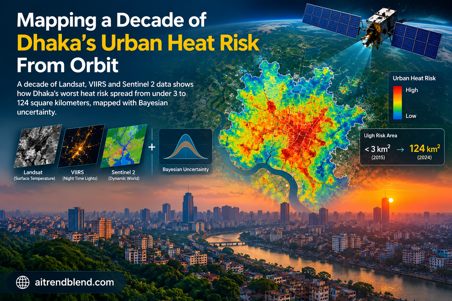
Picture a satellite passing over Dhaka just after ten in the morning local time, quietly recording how hot the ground has become beneath one of the densest cities on the planet. It does this again and again for ten straight years, and when a team of researchers finally stitched the record together they found something city planners had not fully appreciated. The citywide heat score barely moved after 2018. Meanwhile the ground actually classified as severely at risk kept spreading, year after year, into neighborhoods nobody was watching closely.
Key points
- Dhaka’s Heat Vulnerability Index rose from 0.25 in 2015 to 0.43 in 2017, a 72 percent jump, then settled into a range of roughly 0.35 to 0.37 for the rest of the decade.
- Land scoring 0.7 or higher on that same index grew from about 2.6 square kilometers in 2016 to 123.75 square kilometers in 2024, nearly a fivefold increase over 2015 levels.
- A regression analysis found that surface heat intensity alone explains 62 percent of the year to year swings in the whole index, well ahead of built up density at 18 percent.
- Every yearly map comes with its own uncertainty estimate, generated by resampling ten years of data 200 times with a Bayesian bootstrap, and the standard deviation never rises above 0.06.
- The whole pipeline runs inside a public Google Earth Engine dashboard where a planner can drag weight sliders and watch the risk map redraw itself in real time.
A heat score that finally moves with the city, not just the season
Most urban heat coverage still leans on a single striking satellite image. A red blob over downtown, a blue fringe of parks, a headline about record temperatures. That kind of snapshot is useful for a news cycle and almost useless for a city planning department that needs to know where to plant trees, where to widen drainage, or which neighborhood should get priority for a cooling center next summer. Urban heat is not a single event. It is the product of population growth, land conversion and rising baseline temperatures acting together over years, and it lands unevenly across a city (Golden, 2004; He et al., 2023).
A team led by Mahfuzur Rahman, working across King Fahd University of Petroleum and Minerals and two Bangladeshi universities, set out to build something closer to a long running instrument than a snapshot. Their paper, published in Physics and Chemistry of the Earth, tracks Dhaka across ten full years using four independent satellite derived indicators, folds them into a single composite score, and then quantifies exactly how much confidence the numbers deserve. That last part is what separates this from most vulnerability mapping work you will find online. It does not just draw a map and hope you trust it.
What earlier South Asian heat studies tended to miss
Thermal remote sensing has been used to study surface urban heat islands for a long time. Landsat borne sensors made it possible to see how impervious surfaces run hotter than vegetated ones, and researchers in Delhi, Mumbai and Dhaka itself have documented rapid urban expansion tracking closely with rising heat exposure (Gupta et al., 2024; Mangal et al., 2024). Vegetation indices such as NDVI added a second layer, capturing the cooling effect of tree canopy and evapotranspiration (Gobatti et al., 2023; Zaid et al., 2025). Night time light data from VIIRS gave researchers a proxy for population density and anthropogenic activity, since brighter areas tend to burn more energy and generate more waste heat (Mokhtari et al., 2025).
The gap was integration. Most of that prior work treated these signals separately, or folded them into a single static composite built for one year. Few studies explicitly carried uncertainty through the whole pipeline, from how you normalize raw pixel values, to how you weight each indicator, to how you aggregate them into one final number (Karimi et al., 2025; Kumar and Mishra, 2025). And almost none of it landed in a tool a working planner could actually open and adjust. This paper tries to close all three gaps at once, using Dhaka as the proving ground.
Four satellites, one composite score
The researchers call their composite the Heat Vulnerability Index, or HVI. It combines four indicators, each derived from a different sensor and each capturing a different dimension of risk.
Surface heat anomaly from Landsat thermal bands
Land surface temperature came from the atmospherically corrected ST_B10 product on Landsat 8 and Landsat 9, restricted to clear sky pixels using the built in quality flags and composited as the median value across the warm season, April through September, for each year from 2015 to 2024. To turn raw temperature into a meaningful anomaly, the team defined a rural reference ring around Dhaka, an annular buffer running from 5 to 25 kilometers outside the district boundary, with anything beyond 40 kilometers from the city center excluded to avoid pulling in unrelated floodplain or industrial landscapes. Urban and water pixels inside that ring were also stripped out using Sentinel 2 Dynamic World and ESA WorldCover masks, leaving a stable non urban baseline. The anomaly is simply the pixel temperature minus that rural mean. In total 212 Landsat scenes across WRS Path 137, Rows 43 and 44 fed the ten year record, with consistent late morning overpass timing around 10:23 to 10:31 local time.
Vegetation scarcity from NDVI
NDVI came from the same Landsat surface reflectance bands, computed the standard way from the near infrared and red channels, then normalized and inverted so that higher values represent less vegetation cover rather than more. That inversion matters conceptually. It reframes green cover not as a nice to have amenity layer but as a direct driver of heat exposure, since vegetation loss removes the shading and evapotranspiration that would otherwise dampen surface heating.
Night time lights as a proxy for anthropogenic intensity
Monthly VIIRS DNB VCMCFG composites were aggregated into an annual median radiance, with negative values masked and the top and bottom two percent of readings clipped to reduce sensor noise before normalization. Night lights do double duty here, standing in for both population density and the waste heat that comes from energy use and metabolic activity concentrated in busy urban cores.
Built up probability from Sentinel 2 Dynamic World
Rather than relying on a binary built or not built land cover class, the team used the continuous built probability band from Dynamic World V1 at 10 meter resolution, taking the warm season median for each year. That probabilistic framing lets the index capture the messy in between reality of peri urban land, where a pixel might be half built, half fallow field, in a way a hard classification boundary simply cannot.
The math holding it together
Each of the four indicators gets normalized the same way, using robust percentile scaling rather than a simple minimum to maximum stretch, which keeps a handful of extreme pixels from distorting the whole layer.
Robust normalization using the 2nd and 98th percentiles, computed within the Dhaka boundary for each indicator.
The surface heat anomaly itself is simply the pixel temperature compared against that rural background.
The surface urban heat island anomaly at pixel x, relative to the rural reference ring.
Once all four layers sit on the same 0 to 1 scale, they combine into the HVI through a weighted mean, with surface heat carrying half the weight by design, reflecting its role as the dominant physical driver, and the other three indicators splitting the remainder.
Default weighting, SUHI at 0.50, night time lights at 0.20, built up probability at 0.20, inverted NDVI at 0.10.
Teaching the index to admit what it does not know
This is the part most heat vulnerability studies skip entirely, and it is arguably the paper’s most useful contribution. Rather than reporting a single deterministic HVI value per pixel per year and calling it done, the team ran a Bayesian bootstrap across the whole decadal stack. For each of 200 replicates, they drew a set of random weights from a noninformative Dirichlet distribution and used those weights to blend the ten annual HVI layers into a bootstrap realization.
Year specific Dirichlet weights generate a distribution of plausible composite outcomes rather than one fixed number.
Across all 200 replicates, the per pixel mean and standard deviation give a spatially explicit picture of confidence, not just a single citywide error bar.
Per pixel bootstrap mean and standard deviation across B equals 200 replicates.
Convergence diagnostics showed the mean and variance stabilizing well before all 200 replicates were used, which is a reassuring sign the resampling count was more than sufficient rather than arbitrarily chosen.
What the decade actually looked like on the ground
The headline number is almost boring on its own. Mean HVI climbed from 0.25 in 2015 to a peak of 0.43 in 2017, then drifted down and leveled off somewhere between 0.35 and 0.37 through the early 2020s, ending at 0.35 in 2024. Read in isolation, that looks like a city whose heat risk intensified early and then plateaued. Read alongside the spatial data, it looks like something else entirely.
| Year | Mean HVI | Area HVI 0.7 or higher (km²) | Bootstrap SD |
|---|---|---|---|
| 2015 | 0.25 | 26.32 | 0.03 |
| 2016 | 0.30 | 2.57 | 0.03 |
| 2017 | 0.43 | 104.78 | 0.04 |
| 2018 | 0.34 | 110.89 | 0.04 |
| 2020 | 0.40 | 74.23 | 0.05 |
| 2022 | 0.37 | 73.80 | 0.06 |
| 2024 | 0.35 | 123.75 | 0.05 |
Look at that third column instead of the second. Between 2016 and 2017 the area scoring above the high vulnerability threshold jumped by more than 3900 percent, from 2.57 square kilometers to 104.78. It never really retreated after that. By 2024 it had reached 123.75 square kilometers, close to five times the 2015 figure, even while the citywide average sat almost exactly where it started the decade.
The city’s average heat score told a story of stabilization. The map underneath it told a story of quiet, relentless spread. Editorial synthesis of the study’s central finding
Why this matters
Any policy dashboard that only tracks a citywide average would have told planners the problem stopped getting worse after 2018. The threshold based area metric tells a very different story, one where extreme risk kept colonizing new peri urban ground the whole time. Averages hide exactly the kind of emerging hotspot a resilience budget needs to find first.
What is actually driving the spread
A regression between annual mean HVI and each component indicator found that surface heat anomaly alone explains 62 percent of the year to year variance, with a p value below 0.01. Built up probability came in second at 18 percent, significant at the 0.05 level. That ordering matches the physical story on the ground. Night time lights climbed steadily after 2018, which the authors read as continued anthropogenic intensification rather than sensor drift, since the data had already been filtered and clipped to remove noise. Built up probability expanded most aggressively in peri urban fringes, exactly where the probabilistic Dynamic World layer earns its keep by capturing half converted transitional land that a binary classifier would have missed. Inverted NDVI, meanwhile, rose fastest in those same fringe areas, and the overlap between rising built density and falling vegetation cover reads as a feedback loop. Remove the trees and the shading and the evapotranspiration that came with them, and the surface heat signal amplifies right where the built environment is already spreading.
Context worth knowing
Dhaka’s own green space works out to under 1 square meter per resident, far below World Health Organization guidance. Combine that scarcity with a delta city’s flat, low lying terrain, which limits ventilation and prolongs nighttime heat retention, and the physical conditions for exactly this kind of outward spreading vulnerability are already stacked against the city before you add a single satellite pixel.
From a research finding to a tool a planner can actually touch
The most transferable part of this paper might not be the index itself but the decision to operationalize it. The whole pipeline runs inside an interactive Google Earth Engine dashboard, with a map viewer for each year from 2015 to 2024, sliders for adjusting the weight given to each of the four indicators, a movable threshold control for defining what counts as high risk, and a control for how many bootstrap replicates to run. Users can export results as GeoTIFF or CSV files for further work outside the browser. That combination, an uncertainty aware statistical framework wrapped inside a tool a nonspecialist can click through, is a meaningfully different deliverable than a static PDF map, and it is the kind of thing that actually gets used by a planning department rather than filed away after publication.
Honest limitations
The study leans entirely on clear sky Landsat observations, which introduces a bias toward fair weather conditions and means the index should be read as a relative exposure metric rather than an absolute measure of thermal extremes. It captures environmental exposure well but does not incorporate socio demographic vulnerability factors such as income, age, housing quality or access to cooling, all of which shape who actually suffers from a given level of heat exposure. The four indicator weights, while tested for sensitivity, remain a normative choice made by the research team rather than something derived purely from the data. And while the authors report that hotspots stayed stable across plausible weighting ranges, applying this exact framework to another city would require local recalibration of the seasonal window, the rural reference zone definition, and the weighting scheme, none of which transfer automatically.
Where this goes next
The authors point toward a few natural extensions. Folding in socio demographic and health related indicators would shift the framework from measuring exposure toward measuring realized risk, which is ultimately what determines who gets hurt. Higher temporal resolution thermal sensors, such as ECOSTRESS or geostationary platforms, could resolve diurnal heat patterns that a single late morning Landsat overpass simply cannot see. And pairing the HVI with downscaled climate projections and urban growth scenarios would turn this from a historical accounting tool into something closer to a forecasting one, letting planners test adaptation pathways before committing budget to them.
Reproducing the core pipeline
The published study runs entirely inside Google Earth Engine rather than a conventional machine learning framework, since the core method is a statistical composite and a nonparametric uncertainty estimator rather than a trained model. To make the underlying logic easy to test and adapt outside Earth Engine, the implementation below reproduces the same normalization, weighted aggregation, threshold area calculation and Dirichlet based Bayesian bootstrap using PyTorch tensors, with a small synthetic dataset standing in for a real decade of satellite pixels.
# dhaka_hvi_pipeline.py
# Reproduces the paper's normalization, weighted HVI aggregation,
# threshold area calculation, and Dirichlet based Bayesian bootstrap
# using PyTorch tensors on a synthetic pixel grid.

import torch
from torch.distributions import Dirichlet


class HeatVulnerabilityPipeline:
    """Implements the four indicator HVI composite and its bootstrap
    uncertainty layer, matching Rahman et al., 2026, Physics and
    Chemistry of the Earth, 143, 104399."""

    def __init__(self, low_pct=2.0, high_pct=98.0, weights=None):
        self.low_pct = low_pct
        self.high_pct = high_pct
        # default weights from the paper, SUHI 0.50, NTL 0.20, BU 0.20, NDVI 0.10
        self.weights = weights or {
            "suhi": 0.50,
            "ntl": 0.20,
            "bu": 0.20,
            "ndvi_inv": 0.10,
        }

    def robust_normalize(self, x: torch.Tensor) -> torch.Tensor:
        """Percentile based min max scaling to the 0 to 1 range,
        computed per year across the whole pixel grid."""
        flat = x.flatten()
        p_low = torch.quantile(flat, self.low_pct / 100.0)
        p_high = torch.quantile(flat, self.high_pct / 100.0)
        denom = torch.clamp(p_high - p_low, min=1e-6)
        normed = (x - p_low) / denom
        return torch.clamp(normed, 0.0, 1.0)

    def suhi_anomaly(self, st_urban: torch.Tensor, st_rural_mean: torch.Tensor) -> torch.Tensor:
        """Pixel surface temperature minus the rural reference ring mean."""
        return st_urban - st_rural_mean

    def invert_ndvi(self, ndvi_norm: torch.Tensor) -> torch.Tensor:
        return 1.0 - ndvi_norm

    def compute_hvi(self, suhi_n, ntl_n, bu_n, ndvi_inv_n) -> torch.Tensor:
        """Weighted mean aggregation of the four normalized indicators."""
        w = self.weights
        total_w = sum(w.values())
        numerator = (
            w["suhi"] * suhi_n
            + w["ntl"] * ntl_n
            + w["bu"] * bu_n
            + w["ndvi_inv"] * ndvi_inv_n
        )
        return numerator / total_w

    def area_above_threshold(self, hvi: torch.Tensor, pixel_area_km2: float, tau=0.7) -> float:
        """Total area, in square kilometers, where HVI meets or exceeds tau."""
        mask = (hvi >= tau).float()
        return (mask.sum() * pixel_area_km2).item()

    def bayesian_bootstrap(self, annual_hvi_stack: torch.Tensor, num_replicates=200):
        """Dirichlet weighted bootstrap across years, following Eq. 10 to 13
        of the paper. annual_hvi_stack has shape (n_years, H, W)."""
        n_years = annual_hvi_stack.shape[0]
        alpha = torch.ones(n_years)
        dirichlet = Dirichlet(alpha)

        replicates = []
        for _ in range(num_replicates):
            year_weights = dirichlet.sample()
            weighted_sum = torch.einsum("y,yhw->hw", year_weights, annual_hvi_stack)
            replicates.append(weighted_sum)

        stacked = torch.stack(replicates, dim=0)
        mean_hvi = stacked.mean(dim=0)
        std_hvi = stacked.std(dim=0, unbiased=True)
        return mean_hvi, std_hvi

    def convergence_check(self, annual_hvi_stack: torch.Tensor, max_replicates=200, step=20):
        """Tracks how the citywide mean stabilizes as replicate count grows,
        mirroring the paper's convergence diagnostics."""
        history = []
        for b in range(step, max_replicates + 1, step):
            mean_hvi, _ = self.bayesian_bootstrap(annual_hvi_stack, num_replicates=b)
            history.append((b, mean_hvi.mean().item()))
        return history


def run_smoke_test():
    """Dummy ten year, 64 by 64 pixel grid standing in for a real
    Dhaka Landsat, VIIRS and Sentinel 2 decade. Confirms the pipeline
    runs end to end and produces sane shapes and ranges."""
    torch.manual_seed(42)
    n_years, height, width = 10, 64, 64
    pixel_area_km2 = 0.0009  # 30 meter Landsat pixel, roughly

    pipeline = HeatVulnerabilityPipeline()
    annual_hvi = []

    for year in range(n_years):
        st_urban = 300 + torch.randn(height, width) * 3.0 + year * 0.4
        st_rural_mean = torch.tensor(296.0)
        ntl_raw = torch.rand(height, width) * (10 + year)
        bu_prob = torch.clamp(torch.rand(height, width) + year * 0.01, 0, 1)
        ndvi_raw = torch.clamp(torch.rand(height, width) - year * 0.01, 0, 1)

        suhi_raw = pipeline.suhi_anomaly(st_urban, st_rural_mean)
        suhi_n = pipeline.robust_normalize(suhi_raw)
        ntl_n = pipeline.robust_normalize(ntl_raw)
        bu_n = pipeline.robust_normalize(bu_prob)
        ndvi_n = pipeline.robust_normalize(ndvi_raw)
        ndvi_inv_n = pipeline.invert_ndvi(ndvi_n)

        hvi_year = pipeline.compute_hvi(suhi_n, ntl_n, bu_n, ndvi_inv_n)
        annual_hvi.append(hvi_year)

        area = pipeline.area_above_threshold(hvi_year, pixel_area_km2, tau=0.7)
        print(f"Year {year}, mean HVI {hvi_year.mean().item():.3f}, area above 0.7 {area:.4f} km2")

    stack = torch.stack(annual_hvi, dim=0)
    boot_mean, boot_std = pipeline.bayesian_bootstrap(stack, num_replicates=200)
    print(f"Bootstrap mean HVI {boot_mean.mean().item():.3f}")
    print(f"Bootstrap std HVI {boot_std.mean().item():.3f}")

    convergence = pipeline.convergence_check(stack, max_replicates=200, step=40)
    for b, val in convergence:
        print(f"Replicates {b}, running mean {val:.4f}")

    assert stack.shape == (n_years, height, width)
    assert 0.0 <= boot_mean.mean().item() <= 1.0
    print("Smoke test passed.")


if __name__ == "__main__":
    run_smoke_test()
The bigger picture
Strip away the satellite jargon and this paper is really making one argument. A single citywide number, however carefully computed, can quietly mislead the people relying on it. Dhaka’s average heat score looked calm for six straight years. Underneath that calm surface, the area of genuinely dangerous heat exposure grew by a factor of nearly five, and it grew specifically in the peri urban margins where planning attention tends to be thinnest. That is not a criticism of averages as a concept, it is a reminder that any single summary statistic hides distribution, and distribution is exactly what determines who bears the cost.
The conceptual shift worth carrying away from this work is treating a vulnerability index the way you would treat a scientific measurement rather than a marketing figure. Every value ships with a credible interval. Every weighting choice gets tested against alternatives. Every threshold gets justified rather than assumed. That habit of mind, more than any single satellite product, is what makes this framework worth studying even if you never touch a pixel of Dhaka imagery yourself.
It is also genuinely transferable. Every input, Landsat Collection 2, VIIRS DNB monthly composites, Sentinel 2 Dynamic World, ESA WorldCover, is freely available worldwide, and the whole computation runs inside Google Earth Engine at no cost to the user. A team in Lagos, Jakarta or Manila could, in principle, swap in their own city boundary and rural reference ring and get a comparable decadal index within a reasonable amount of engineering effort. The paper is explicit that local calibration would still be required, particularly around the seasonal window and the rural reference definition, but the architecture itself does not depend on anything unique to Bangladesh.
What remains unresolved is arguably the more important half of the vulnerability question. This framework measures exposure with real rigor, but exposure is not the same thing as harm. A hectare of extreme surface heat next to a well resourced neighborhood with reliable electricity and air conditioning is a very different risk than the same hectare next to an informal settlement without either. Folding in the socio demographic layer the authors flag as future work would turn this from an exposure map into something closer to an actual risk map, and that is a much harder, much more consequential project.
For now, the honest way to read this study is as proof that the plumbing works. The normalization holds up under alternate percentile choices. The bootstrap converges well before its replicate budget runs out. The hotspots stay put across different weighting schemes. A decadal, uncertainty aware heat index for a data scarce tropical megacity is achievable with entirely public data and a browser based tool, and that is a meaningfully higher bar than most heat mapping work clears.
Read the full peer reviewed study, including the complete Landsat scene metadata and supplementary uncertainty diagnostics, directly from the publisher.
Frequently asked questions
What is a Heat Vulnerability Index and how is it different from a plain heat map
A plain heat map usually shows surface temperature for one moment or one season. A Heat Vulnerability Index like the one in this study combines several signals, in this case surface heat anomaly, vegetation scarcity, night time light intensity and built up probability, into a single weighted score, so it captures structural risk rather than just a hot afternoon.
Why did the researchers use a Bayesian bootstrap instead of a standard confidence interval
A standard confidence interval usually assumes the underlying data follows something close to a normal distribution. The Bayesian bootstrap avoids that assumption by resampling the ten years of composite layers with random Dirichlet weights, which lets the researchers estimate uncertainty without imposing a shape on the data that might not actually hold.
Why did Dhaka’s average heat score look stable after 2018 if conditions were getting worse
The citywide mean averages together stable urban core areas and rapidly changing peri urban fringe areas. Once the core stopped intensifying much further, the average leveled off even though the total area classified as extremely vulnerable kept expanding outward, which is exactly the divergence the study highlights as its main finding.
What satellite data did the study actually rely on
Four public datasets. Landsat 8 and 9 Collection 2 Level 2 surface temperature and reflectance for surface heat and NDVI, VIIRS DNB VCMCFG monthly composites for night time lights, Sentinel 2 Dynamic World for built up probability, and ESA WorldCover for masking out water bodies.
Can this same framework be applied to a different city
The authors argue yes, since every input dataset is freely available worldwide and the whole pipeline runs inside Google Earth Engine. They do note that the seasonal window, the rural reference zone definition and the indicator weights would all need local recalibration rather than being copied directly.
Is the interactive dashboard publicly available
The paper states that the complete Google Earth Engine code and reproducibility tables are publicly accessible, though the specific dashboard link was not included in the material reviewed for this article. Check the publisher page linked above for the current access details.
Explore more from this pillar
Rahman M, Rahman M, Benaafi M, Jany M R. Multi sensor remote sensing with Bayesian uncertainty for urban heat vulnerability mapping in Dhaka City. Physics and Chemistry of the Earth. 2026, 143, 104399. https://doi.org/10.1016/j.pce.2026.104399
This analysis is based on the published paper and an independent evaluation of its claims.